Guide to usability, the key to an easy, effective and useful site
Having a usable website is not only beneficial for users, but also for our goals and results. Putting the user at the center by now has (or at least should have) become a mantra to follow in every aspect of digital marketing and SEO, both because people are the ultimate recipients of our content (and optimization efforts) and because Google, at least in its intentions and statements, is increasingly trying to bring out pages that make the user experience efficient and satisfying. And this is where usability comes in, an element that relates to the effectiveness, efficiency and, indeed, overall satisfaction felt by people browsing the site and web pages: in a nutshell, it is the factor that determines whether a site visit will be pleasant and productive or frustrating and brief. So let’s delve into what “usability” of a website really means and how we can measure and improve it.
What is website usability: definitions and explanation
Simply put, usability is the ability of a website to be used easily, efficiently and satisfactorily by users to achieve specific goals. A usable website is intuitive, unobstructed, and allows desired activities to be performed with minimal effort.
It should be specified that the concept did not originate with the Web, but is much earlier: at a general level, usability is a quality attribute that refers to the ease of use of user interfaces of various types. More precisely, it is a set of factors and elements used to evaluate the effectiveness, efficiency and overall satisfaction of the user in his or her interactions with products or systems, including software, devices, applications and, indeed, websites.
Take care of your site and users


Today, the concept of usability is also set by the ISO 9241 standard, which defines it as “the degree to which a product can be used by particular users to achieve certain goals with effectiveness, efficiency and satisfaction in a specific context of use.”
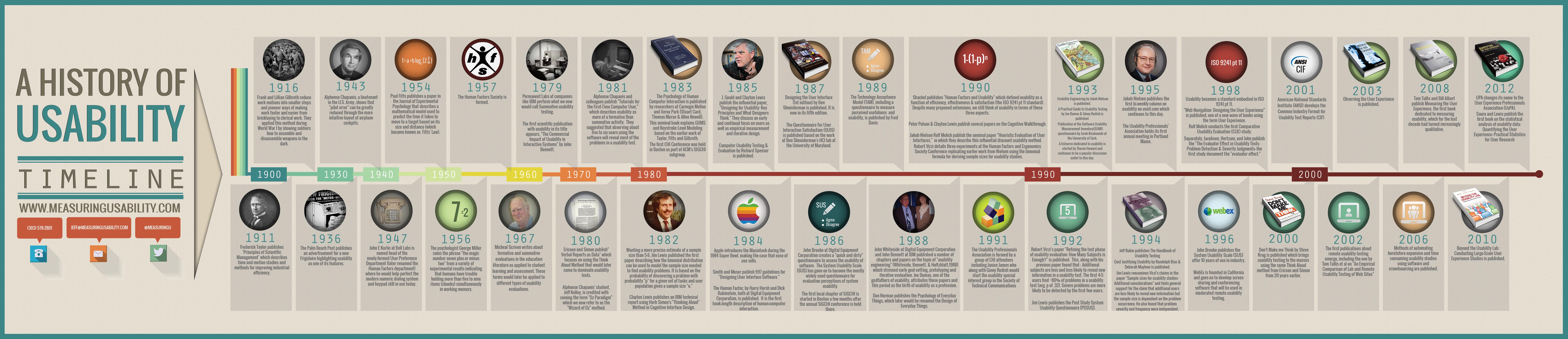
The history and evolution of attention to the topic
In its broadest sense – and thus as the ease with which an individual can use a tool or system to achieve a goal – usability is a concept that has deep roots in the history of human innovation, and its evolution is directly intertwined with technological progress and the growing desire to create environments, objects and systems that improve the quality of life.
We can glimpse the first attempts to focus on usability in the period of the great industrialization, when mass production made it necessary to standardize processes to make products more accessible to a wider audience. It was particularly in Taylorism, the theory developed by U.S. engineer Frederick Winslow Taylor (and presented in the monograph The Scientific Organization of Labor, 1911) that laid the groundwork for what we know today as the study of usability, although its focus was primarily on the efficiency of industrial production through scientific analyses of the timing and movement of labor.
It is precisely the industrial field, along with the military, in which these principles are sought to be applied. Well known in this regard are the experiments of Frank Gilbreth and Lillian Moller Gilbreth, who succeeded in optimizing the work activities of workers by studying their habits and reducing their operations into smaller, but also faster and simpler steps. In both World War I and World War II, then, usability was applied in a decidedly practical context: for example, it was precisely the optimization of activities that served as a guide to teach soldiers how to assemble and disassemble weapons in the dark, while in 1943 Alphonse Chapanis, a U.S. Army serviceman, demonstrated that “pilot error” could be reduced through the introduction of a more intuitive console, which effectively led to the creation of a new design for cockpits that reduced human error and improved performance.
Coming out of the war industry, then, as early as 1936 the Palm Beach Post published an advertisement for a new refrigerator in which, for the first time, usability was mentioned as one of the features, while in the late 1940s John Karlin persuaded Bell Labs to establish a User Preferences Department (later Human Factors Engineering Dept, for which Karlin himself would be responsible), which set up numerous empirical research projects, such as the usability of numerical input systems and the human ability to remember sequences of digits, including perfecting the number dialing system that underlies the modern telephone keypad still in use today.
Another relevant point in this chronology is 1967, when the British-born Australian academic polymath and philosopher Micheal Scriven composed a system of assessments in education dedicated to student learning, which would later become the basis, including terminology, for different types of usability assessments.
Looking more specifically at the IT field, we recognize several phases of awareness and focus on usability factors, which originally referred mostly to software applications and design.
In fact, and at least until the 1970s, we can speak of usability being absent or almost absent: being used by the designer himself or by a small number of users, usually with very similar skills and culture to the designer, computer-based products did not have to pose usability problems and there was substantial coincidence between the user model and the design model. Notable exceptions are the studies of pioneers such as Douglas Engelbart, who invented the mouse, and Alan Kay, who contributed to the development of graphical user interfaces, making computers more accessible, who began to focus on human-computer interaction (HCI).
As early as the late 1970s, however, something changed: it was in 1979 that Permanent Labs experimented with “summative usability testing” at IBM, and at the same time the first scientific publication with the term usability in the title, The Commercial Impact of Usability in Interactive Systems by John Bennett, appeared.
It was from the mid-1980s that usability began to develop and become a real science, combining psychology and artificial intelligence with computer science. A concrete example of this “transformation” is the emergence of usability labs, which test products with potential users prior to commercial launch, and which respond to a practical (and business-related) need: given the spread of information technology in offices and home settings, users no longer share expertise with designers, which means that the usability problems that make these user experiences fruitless and frustrating are beginning to be felt.
However, the approach focused only on the final evaluation is not sufficient to solve these problems and ensure the effectiveness of the process, because any changes cost too much or come too late: therefore, in the 1990s, different and broader solutions are experimented with, which also intervene “upstream.” Credit for this conceptual evolution also goes to the work of scholars such as Don Norman, author of the celebrated work The Masochist’s Coffee Pot. Psychopathology of Everyday Objects (1987) and later creator, together with Jakob Nielsen, of Nielsen Norman Group, a business consulting firm for human-centered services and products (from whose blog we have drawn various information used for this article).
Thus was born the cascade design, which introduces usability evaluation criteria at each stage of the product development cycle (conception, prototyping, engineering, launch), which subsequently evolves into participatory design, which sees the involvement of users-as well as that of specialists-in the stages that define the process, in order to reach all together a finished product that meets concrete needs. In this sense, then, the production of software, but also of sites and other IT and digital products, stops being a simple linear process and becomes an iterative process, in which the final result is reached through successive adjustments guided by the continuous verification of the end user’s needs and requirements.
Looking quickly at other key moments in this journey – also well represented by the infographic below – in 1998 we have the official definition of usability according to ISO and the publication of various studies on the subject (which also begin to focus on Web browsing and user experience), while in the 2000s the front line becomes even broader, techniques for measuring usability factors are perfected, and automation and artificial intelligence systems applied for the purpose also begin to be exploited.
With the advent of the Internet, usability also became a critical factor in web design, with user experience (UX) taking a central role in determining the success of a website. Today, usability is intertwined with digital accessibility and inclusiveness, recognizing the need to design experiences that are usable by all, as emphasized by the Web Content Accessibility Guidelines (WCAG) and digital accessibility laws, which have reinforced the importance of creating experiences that are usable by a broad spectrum of people and potentially by everyone, including those with disabilities.
Focus on WCAG, the guidelines for digital usability and accessibility
To be precise, the WCAG are a set of recommendations developed through the W3C (World Wide Web Consortium), the international organization working to develop standards for the Web, and have become the global benchmark for Web accessibility, adopted by many organizations and governments as part of their legal or regulatory standards.
The goal of WCAG is to provide an inclusive digital environment that can be used by everyone, regardless of their physical or cognitive abilities, and from 1999 to the present there have been several evolutions of this set of recommendations, with updates reflecting changing technologies and growing accessibility needs.
For example, the first version of WCAG (1999) contained 14 guidelines and focused primarily on HTML and basic web technologies, while the second (WCAG 2.0, 2008) introduced POUR principles and the third (WCAG 2.1, 2018) added success criteria to improve accessibility for users with visual, motor, hearing, and cognitive impairments, while also taking into account the increasing use of mobile devices. The latest version at the moment is WCAG 2.2 (become a W3C recommendation on Oct. 5, 2023), which still introduce 9 new criteria and new sections detailing aspects of the specification that could impact privacy and security; in addition, it has been reported that the Working Group on Accessibility Guidelines has already developed the first public working draft of the future WCAG 3.0, but there is still no certainty about the timing of official release.
In light of this, today’s WCAG is based on four core principles, known as POUR, which establish the fundamentals for Web accessibility. The acronym POUR stands for:
- Perceivable. Information and user interface components must be presented in ways that can be perceived by all users, which means that they cannot be invisible to all their senses.
- Operable. User interface components and navigation must be operable, meaning that users must be able to interact with all controls and features.
- Understandable. The information and operation of the user interface must be understandable, ensuring that users can understand the content and learn and remember how to use the interface.
- Robust. Content must be robust enough to be reliably interpreted by a wide range of user agents, including browsers and assistive technologies.
For each of the POUR principles, the WCAG defines specific success criteria that provide practical guidelines on how to achieve accessibility. These criteria are divided into three levels of compliance:
- Level A. The lowest level, which addresses the most severe barriers to accessibility.
- Level AA. Includes the requirements of Level A and adds additional requirements to address the most common accessibility problems.
- Level AAA. The highest level, covering the most advanced success criteria and providing the best possible user experience.
Many legal standards require compliance with at least WCAG Level AA, considered a balance between significant improvements in accessibility and feasibility of implementation.
Web site usability, what are the key principles
In the digital realm, therefore, site usability has become a science, with well-defined principles and techniques, and the expression also refers to the set of methods that can improve the usability of a site during the design process. In a broader sense, usability aims to simplify the user experience, enabling people to find the necessary information on sites and pages easily and intuitively, understanding the content without experiencing difficulties.
In more direct terms, when we talk about usability we refer to the ease with which users can perform the desired actions within a website. This translates into a number of pivotal principles such as clarity, which urges us to create interfaces that are understandable at first glance, and consistency, which helps users find their way through recurring and predictable elements.
However, there are several principles that contribute to web usability, including:
- Effectiveness: the user must be able to achieve his or her goals with minimal effort and in as little time as possible.
- Efficiency: the interface must be simple and intuitive to use, with a minimum of actions required to complete a task.
- Satisfaction: the user must feel a sense of satisfaction and pleasure in using the website.
- Accessibility: the website must be accessible to all users, regardless of their abilities or technologies used.
The factors that determine website usability
To understand the importance of usability and how to “curate” it on the site to ensure a good user experience we must, first of all, understand that we are not talking about a single, one-dimensional property of a product, system, or user interface, but rather a combination of factors that includes, for example:
- Intuitiveness of design, that is, the implementation of a system of site architecture and navigation that allows the user to understand it quickly and almost effortlessly.
- Ease of learning, which defines how easy it is for users to perform basic tasks when first approaching the interface.
- Usage efficiency, which is the speed with which a user can complete tasks after learning the basics and becoming familiar with the interface.
- Memorability, which focuses on whether users can remember the skills they have learned after visiting the site to use it effectively in future visits and after a period of inactivity.
- Error frequency and severity, which studies precisely how often users make errors while using the system, the severity of errors, and how users can recover from errors.
- Subjective Satisfaction, the degree of satisfaction and pleasure users feel when using the site.
These are also referred to as the 6 quality components of usability applied to a website and refer to the main usability attributes defined in the Sun Usability Lab, which among other things suggest answering questions about:
- Usefulness: what is the very point of the site? What does it serve? And who does it serve? And is the design functional, i.e., does it do what users need it to do?
- Ease of learning: How do new users behave when faced with the site? Are they hesitant? Do they find themselves in areas they don’t know the general meaning of and can’t tell how they got there? Do they not know “how” to perform the task they desire?
- Error prevention: does the site contain errors of various kinds? Do people make mistakes or use the back button often (a sign that they have performed unwanted operations or found themselves on different pages than intended)?
- Satisfaction: does navigating and using the site prove to be fun and satisfying or does it create anxiety and frustration?
It is clear, however, that usability has a lot to do with usefulness: it matters little if something is easy or beautiful if it does not allow us to get what we want, just as (in the opposite sense) it is not good if the system can hypothetically do what we need but we cannot achieve it because the user interface is too difficult.
It follows, then, that our goal is to create a project that brings both of these crucial factors together, and that is useful in the English meaning of the term, that is, respects utility and usability as considered thus:
- Utility: ability to provide the functionality the user needs .
- Usability: level of quality, ease and pleasantness of use of these functionalities.
- Useful: a design that sums up usability plus usefulness.
The benefits of a usable website
But what are the reasons that should convince us to adopt this approach for our digital business?
In a nutshell, a usable website is one that works for us and for those who visit it, from which it follows that a website with good usability ensures numerous benefits, including:
- Improved user experience: users are more satisfied and likely to return to the website.
- Increased dwell time: users spend more time on the website, increasing the chances of conversion.
- Improved SEO: pages are more easily understood and indexed by search engines, with potential positive effects on ranking..
- Higher return on investment (ROI): a website with good usability generates more conversions and thus a higher return on investment.
Although we may not realize it, on the Web usability is a necessary condition for survival even before success: very trivially, if a site turns out to be difficult to use, if the home page does not clearly indicate what a company offers and what users can do on the site, if users get lost between pages, if information is difficult to read, if content does not answer users’ key questions, in all these cases (and others) people leave.
Users do not read a website “user manual” and do not have time to spend on studying and understanding an interface, partly because there are many other websites available and so looking for alternatives is the first line of defense when they encounter a difficulty.
According to experts, the latest best practices in the field call for spending about 10 percent of a design project’s budget on usability: on average, this effort will more than double the desired quality metrics of a Web site, while for software and physical products the improvements are generally smaller, but still substantial.
In concrete terms, doubling usability for internal projects means reducing training budgets by half and doubling the number of transactions performed by employees per hour. For external projects, the aspect we are most interested in, usability doubling corresponds to doubling sales, doubling the number of registered users or customer leads, or doubling any other KPI (key performance indicator) that underlies this project.
How to do a usability assessment
Having briefly clarified the theoretical aspects, let’s go into some of the concepts related to the systems we have to understand whether our site actually succeeds in being useful, and then find out what the usability evaluation methods are and when it is appropriate to implement them.
Usability evaluation focuses on how users can learn and use a product to achieve their goals, and also refers to the level of user satisfaction with that process. To gather this information, practitioners use a variety of methods that gather feedback from users on an existing site or on plans for a new site, such as interviews, surveys, or observation sessions.
We can also make use of specific techniques such as A/B testing, which compares two versions of a page to see which one performs better, or eye tracking, which shows us where users’ eyes rest; in addition, heuristic analyses allow us to evaluate the site following well-established guidelines, while direct user feedback is always a gold mine of information.
There are two types of data we can obtain: qualitative data and quantitative data. The latter detect what actually happened, while qualitative data describe what participants thought or said. After collecting the data, we will use it to determine the usability of the website, recommend improvements, implement recommendations, and retest the site to measure the effectiveness of the changes.
In general, the key to developing highly usable sites is the choice of a user-centered design, set to the user’s needs, but testing activities (and any necessary corrections) should be performed frequently and consistently, because problems can also emerge unexpectedly later.
At the ideal level, however, usability should be ensured and taken care of at every stage of the design process, because it can assist us in content development, information architecture, visual design, interaction design and, not least, overall satisfaction. The only way to achieve a high-quality user experience is to start user testing early in the design process and continue testing at every stage of the process.
Quickly, testing opportunities include tools and activities such as:
- Basic usability testing on an existing site (to identify good parts to keep or emphasize bad parts that create problems for users).
- Focus groups, surveys or interviews to establish user goals.
- Test Card Sort, to assist with AI development.
- Wireframe testing, to evaluate navigation.
- First click testing, to verify that users are following the right path.
- Usability testing, to evaluate end-to-end user interaction.
- Satisfaction surveys, a field study to see how the site behaves in the real world and how users behave in their habitat
Individual tests, or a combination of these, could radically improve site, system, or application usability.
Measuring the quality of site UX: Google’s HEART framework
Over time, of course, various models have been developed to help organizations focus on specific aspects of the user experience that would be appropriate to improve, so as to “objectify” areas for action by analyzing specific key factors.
Among several, Google’s HEART framework is a flexible and easy-to-understand way to define user experience metrics and offer a structured approach to setting goals and measuring results.
This measurement model was developed by Kerry Rodden, Hilary Hutchinson and Xin Fu of Google to assess the quality of user experience, and is based on 5 key metrics, identified by the initials of the word HEART, precisely. HEART is in fact an acronym for Happiness, Engagement, Adoption, Retention and Task success, which are considered key constructs intended to account for the most important aspects of user experience. Each of these five key constructs is broken down into high-level goals, behavioral signals and quantifiable metrics.
More specifically:
- Happiness. Measures user enjoyment, often through surveys and feedback that may include metrics such as satisfaction, net promoter score (NPS) or other indicators of user happiness.
- Engagement. Assesses the user’s level of engagement with the product, which can be measured through frequency of use, intensity or depth of interaction with the product.
- Adoption. Pertains to the number of new users who start using the product, a metric that is particularly relevant for new product launches or features.
- Retention. Measures a product’s ability to retain users over time, indicating the percentage of users who continue to use the product after a certain period of time since initial adoption.
- Task success. Evaluates how effectively users can complete specific tasks, which can be measured through task completion time, error rate, or other performance indicators.
Although this framework is flexible and effective in most cases, some of its dimensions (particularly engagement, adoption, and retention) are meaningful only for consumer products and in situations where the user can decide whether to use the product, and thus offers less useful assessments in cases where the end user may not have a choice (such as enterprise products, intranets, health systems, government tools, and many other types of complex apps).
Improving site usability: techniques for acting on critical aspects
In practical terms, we can improve usability by intervening with many methods, the simplest and most useful of which is user testing or user testing, which has 3 components:
- Identify and contact some representative users, such as customers of an e-commerce site.
- Ask users to perform representative tasks with the design.
- Observe what users do, where they succeed and where they have difficulties with the user interface, without intervening or influencing their behavior. It is important to test users individually and let them solve any problems themselves, because if we help them or direct their attention to a particular part of the screen we contaminate the test results.
To identify the most important usability problems in a design, it is usually sufficient to test 5 users; moreover, experts suggest not organizing a large and expensive study, but a larger number of small tests (it is a better and more effective use of resources), reviewing the design between each one so that we can correct usability defects as we identify them. Iterative design is the best way to increase the quality of user experience: the more versions and interface ideas we test with users, the better.
User testing is different from focus groups, which have a place in market research but do not really help in evaluating interaction designs: listening to what people say is misleading, because it is more functional to look at what they actually do and observe individual users closely as they perform tasks with the user interface.
To improve the usability of our site we can also rely on data analysis that we can retrieve through tools such as Google Analytics (on user behavior) or heatmapping software that show us which parts of the page attract the most attention.
Usability and SEO: why working on these aspects can help site ranking
At first glance, usability does not seem to be something closely related to SEO, but this is a short-sighted and obsolete view, as we were already saying when talking about accessibility (which we can also consider work on an even more specific aspect of usability).
Reasoning the old-fashioned way, SEO is about attracting people to the site in the first place by ensuring that it shows up in search queries and emerges in SERPs with proper visibility. Usability, on the other hand, is about how people behave after they arrive on the site, with the main goal of increasing the conversion rate.
According to this distinction, then, SEO happens before the first click and usability starts exactly at the next moment, but in reality we know that this is no longer the case today, and not only because Google has officially sanctioned user experience as a ranking factor with the Page Experience update. Even intuitively, in fact, having great SEO but bad usability means potentially getting a lot of traffic, but low conversion ratio because visitors will not turn into customers. Conversely, a site with great usability but bad SEO simply won’t get many visitors, so it doesn’t matter how good it is.


Keep your site under control
And so, although superficially they seem to focus on different stages of the lead generation funnel, there are many ways in which SEO and usability support each other, especially when we talk about e-Commerce. Not surprisingly, the classic first law of eCommerce reminds us that “if users can’t find the product, they can’t buy it either,” and there is just such a specific method, devised by the aforementioned Jakob Nielsen, which is called heuristic evaluation and is used to identify and solve the usability burdens that hinder an eCommerce to rapidly increase sales.
Another practical aspect to be analyzed is internal site search, an area that can provide valuable support to the user journey, simplifying and shortening their navigation, but is often in danger of being poorly implemented and thus becoming a source of frustration for people.
And so, wanting to try to list some general usability tips applied to SEO:
- Offer stable URLs so that other sites can link directly to each key piece of content without running into a broken link in the future. Where impossible to maintain the initial structure, provide the correct redirect.
- Speak the language of the user in page titles, headings and body of text, adhering to the main guidelines for web writing without neglecting grammatical and syntactical norms.
- Avoid keyword stuffing and other black hat SEO practices that can harm the user experience and, more importantly, cause a negative Google reaction.
- Provide clear information architecture (IA) by setting a designated main page for each element of interest and a clear navigation system that points to these pages so that search engines can infer their centrality.
- Attract inbound links and social mentions by presenting engaging content and frequent updates.
Ensuring usability of pages and content: the aspects to take care of
And so, SEO and usability go hand in hand, because a usable site also tends to be rewarded by search engines. Clear meta tags, a logical URL structure, and a good internal link network are just some of the SEO practices that also improve a site’s usability, and the starting point for ensuring efficient management of these aspects is to design every aspect of the site with the goal of guiding the user to the desired destination.
Specifically, then, we need to focus our attention on elements such as:
- Intuitive Structure and Navigation
Navigation is at the heart of usability. A well-organized and easily accessible menu is the first step in ensuring that users can find their way around without getting lost. Breadcrumbs, those little textual paths that indicate where you are within the site, are another useful tool for keeping the user anchored in context. Internal links are also a key element of usability because they provide users with a logical path to follow and can significantly improve the time spent on the site, as long as each link is relevant and provides added value to the user experience. And let’s not underestimate the power of an effective internal search function, which can quickly take the user exactly where they want to go.
- Responsive Design and Mobile Usability
The world is mobile, and a site that does not adapt to mobile devices is destined to fall behind. Responsive design is not just an aesthetic issue, but a functional necessity: users expect a site to work well on whatever device they use, and we must meet that expectation. Content should flow smoothly between desktops, tablets, and smartphones: text, images, and other elements should be designed to adapt and react to different screen sizes, ensuring that the user experience is consistent regardless of the device being used.
- Loading Speed and Performance
Online patience is measured in seconds, and every moment of waiting increases the risk that the user will abandon the site. Optimizing images, minimizing code, and using content delivery networks (CDNs) are essential steps to ensure that the site loads quickly and smoothly.
- Writing for the Web
Writing for the Web means being concise, clear and direct. Headings and subheadings serve not only to structure the text, but also to capture attention and guide the user through the content. Short paragraphs and bullet points can help make the information more digestible and keep the user engaged. In addition, using the right fonts can also improve readability.
- Use of images and videos
Images and videos can significantly enrich the user experience, but they must be used judiciously: it is critical that these multimedia elements are optimized so as not to slow down page loading and that they are integrated into the context so as not to distract or confuse the user.
Technical optimization to improve usability
Another aspect that should not be overlooked is the technical optimization of the site to ensure usability and accessibility even by Googlebot and other crawlers.
According to an apt definition by Jakob Nielsen, Googlebot is “the world’s richest blind user” because it basically can only understand on-page text and cannot see and analyze images-despite the latest artificial intelligence and pattern recognition techniques, written text and meta-information still remain the basic way to get indexed.
Google’s Martin Splitt and Samsung’s Ada Rose Cannon were also talking about this in one of the SEO mythbusting events on YouTube, devoted precisely to usability, performance metrics as a ranking factor on Google, and the most SEO friendly solutions for developers.
Making the Web more accessible
The talk starts with a general consideration: efforts must be made to make the Web accessible to all people in the world, not only for the (few) people who use the best and newest technological devices or computers, but also for all those who continue to use low-end devices that are years old. Today, however, the modern web does not seem to be able to reach this audience, and indeed meanwhile the qualitative gap between new and old smartphones in terms of performance continues to grow.
It is to overcome these limitations that Google has been insisting heavily on browsing from mobile devices, including through the mobile-first index or mobile page-load speed as a ranking factor on the search engine, culminating in the aforementioned Page Experience signal set, which for the first time officially includes some “user-centric” metrics as ranking factors.
Helping Googlebot by ensuring usability
Splitt then goes on to talk about Googlebot, explaining that it does not interact with the page for very long, so it is not able to determine whether scrolling is comfortable or other such aspects, because it focuses on rendering and, at most, can figure out when the page becomes responsive to input and when the content is ready for user consumption, thus evaluating the performance of these metrics.
In this regard, however, the Google Search Relations Team’s developer advocate also wants to refute blanket statements such as “Javascript will kill your SEO” or “Don’t use React or Angular,” which don’t necessarily have a kernel of truth and can often be a “comforting answer, but not the best answer.” According to Splitt, and as can also be seen empirically, “sites in Javascript can rank on Google,” and the myth that, due to the difficulty of crawling by Googlebot, sites that use JS are at risk of being penalized in ranking should be dispelled: in reality, the problem only concerns the resource indexing phase and, more broadly, usability.
Put another way, sites in Javascript may struggle in terms of usability, because a page that takes time to load does not provide a good level of user experience and does not meet the requirements of the mobile friendly philosophy: therefore, one must evaluate not so much the slowness with respect to crawlers, but the speed in providing users with what they are looking for.
Martin Splitt’s advice, therefore, is to rely on more modern, semantic HTML and CSS rather than heavy JavaScript, partly because HTML and CSS are more resilient than JavaScript (they age better). Specifically, the guidelines are: use polyfill, use progressive enhancement, use what the Web platform provides, and, as a final tip, use JavaScript responsibly.