
What mobile-friendly site means and how to optimize performance
Mobile optimization of a site is no longer just a recommended option, but the only way forward for those who want to remain competitive, both on Google’s SERPs and on users’ concrete choices. Browsing from mobile devices is increasingly becoming the primary form of Internet access, and only by offering mobile-friendly sites with responsive or adaptive structures, adequate content and resources that can be easily loaded even with low connectivity can we hope to intercept traffic. So let’s find out what it actually means to take action to ensure the mobile friendliness of a site, what are some of the effective techniques for designing Web pages optimized for mobile devices, and what tools we can use to monitor performance.
Mobile connections are increasing
Mobile devices-smartphones and to a lesser extent tablets-have become an inseparable part of our lives and our Web experience: a recent report by Statista indicates that by fione 2022 there were 6.64 billion smartphone users worldwide, which will reach 7.5 billion by 2026, and in the middle of last year mobile platforms captured 59 percent of total Web traffic, or more than half of global Web traffic.
Italy, too, is following the mobile-first trend: according to the latest estimates, the Internet is used by 74.9 percent of the national population, and in particular, the 18th Censis Communication Report reveals a sharp increase in the use of the Net for people between the ages of 14 and 80. In practice, nine out of ten Italians in this bracket (88 percent) access online services of various types “showing a perfect overlap with those who use smartphones,” whose percentage is still 88 percent. According to Audiweb‘s latest analysis, on the other hand, almost 44 million unique users connect to the Web in Italy, and on the average day there are 36.7 million users accessing online from mobile devices, browsing from these devices for 2 hours and 42 minutes (while the old desktop computer is used “only” by 20% of the population, on average).
And it would then suffice to think about our daily habits for further confirmation of this trend and to convince us, perhaps definitively, to optimize the site for mobile, both technically and in terms of content.

How to ensure a good user experience from mobile
In short, the data certifies how significant the use of mobile devices is on a global scale and shows us the way forward to remain competitive today, prompting site owners and SEOs to work together with designers and developers to provide an adequate, smooth and seamless user experience for mobile site users. There are three topics to focus on in particular:
- What it means to have a mobile friendly website.
- How to make the site mobile friendly and ensure cross-browser compatibility.
- How to optimize the mobile Web site and its performance to achieve maximum conversions.
So let’s explore what mobile friendly means and what tools we can use to understand if our site meets performance parameters and ensures a good user experience from smartphones.
What does mobile friendly site mean
Let’s start by clarifying what a mobile-friendly site means: this expression refers to sites that use a web design capable of making navigation smooth and usable even for reading from mobile devices, and that are therefore lightweight, with a clear and simple structure, without using animations or problematic software such as the now obsolete Flash, with pages that are readable in their entirety (the user does not have to zoom in on articles due to fonts that are too small or compressed nor scroll horizontally to continue reading) and that make it easy and intuitive to link from one piece of content to another.
In summary, then, mobile-friendliness measures, so to speak, a site’s ability to offer ease of use of its content to users from mobile devices, who can also see the same content present on the desktop site.
Optimize planning and design to be mobile friendly
It is Google itself that pushes hard on these aspects, with a series of tips and guidance contained in its documentation for developers, which outlines precisely the best practices for indexing mobile and mobile-first sites.
Today, in fact, Google uses mobile-first indexing, which is the indexing procedure that prioritizes the mobile version of a site’s content, scanned with Googlebot smartphone agent for indexing and ranking. As we know, this does not mean that only mobile-friendly pages and content can appear in Google Search results, but still the search engine prefers a focus on mobile-friendliness, and therefore we should focus on crare a mobile-optimized website so that users visiting the site from a cell phone can have a great browsing experience.
The three configurations for mobile optimization
In practical terms, Big G identifies 3 possible design configurations geared toward creating a mobile-optimized website:
1. Responsive design
This is the model recommended by Google because it is easiest to implement and manage, and it basically means publishing the same HTML code at the same URL regardless of the users’ device (desktop, tablet, mobile devices, non-visual browsers): thanks to responsive web design technologies, the flexible layout is able to adapt and display content differently depending on the screen size. If, as we said, a mobile-friendly site is based on allowing the same information to be seen from both mobile and desktop, mobile-responsiveness allows ensuring the same experience for users browsing from desktop and mobile.
2. Dynamic publishing
It means using the same URL regardless of device. From a practical point of view, Google explains that this configuration relies on user-agent sniffing and Vary HTTP response header: user-agent to show a different version of HTML to different devices.
3. Distinct URLs
Consists of publishing different HTML code to each device, hosted on distinct URLs. This setup also relies on HTTP user-agent and Vary headers to redirect users to the appropriate version of the site for the device.
We can freely choose one of the systems, based on a basic assumption: each mobile device has unique screen sizes and resolutions, and for a site to perform fully, it must be fully responsive and compatible with multiple browsers so as to provide optimal viewing experiences on multiple devices. If we rely on responsive design, the content and metadata will be the same on the mobile and desktop versions of the pages, whereas dynamic publishing configurations and distinct URLs imply double optimization work.
In fact, as the guide goes on to say, in the latter case we have to take care to ensure a perfect match between what is on the desktop version and what is on the mobile pages, particularly with regard to b structured data, metadata and visual assets such as images and videos, as well as making sure that the rules for displaying ads on mobile devices are met (which otherwise could even damage the ranking of the pages themselves).
How to optimize a mobile site
Your page is not optimized for mobile devices. Or, even worse, These pages have serious usability problems on mobile devices. These are just some of the messages that threaten to take sleep away from those who are involved in online business management but have not yet put in place the improvements needed to be performant even in mobile browsing, which we know is now the method used by most users in the world.
Before we set off in search of tips, techniques and tools for optimizing mobile sites, however, we should understand more generally what it means to optimize a website, and in this sense we take up a statement by our CEO Ivano Di Biasi, who summarizes, “Optimizing a website means reducing the processing time of browsers to improve the user experience,” remembering that “time is the great KPI (Key Performance Indicator) of content and the digital world, regardless of whether it is human or machine time.”
The rules of site optimization: improving experience and navigation for machines and people
Again, then, optimizing a site has a double meaning, because it implies on the one hand the work needed to improve crawling by crawlers and Googlebots, while on the other hand, and no less important, what it takes to satisfy and not frustrate the human people who land on it, who browse the pages, who read the content, who buy products, and so on.
In even more practical terms, optimizing a site means trying to work to best follow the rules imposed by Google and the search engines, adhering to the guidelines set forth by Google, and, last but not least, studying the parameters that become ranking factors to try to produce a finished product that is performant, good, with good content, and fast.
Also because, as John Mueller said some time ago in a thread on Reddit, the funny thing about Google having “so many crawling, indexing, and ranking factors is that you don’t need to do everything exactly the same way all the other sites are doing it” to get positive results, because this variety allows for unique and particular SEO strategies based on cases and contexts. We could therefore say that apparently SEO is yes a science, based on well-defined algorithms, but a science that is not exact (it is only Google that knows all the factors and the way it interprets and evaluates them) and constantly evolving.
The points on which to focus interventions
What has been written is valid in general for every type of website, but the topic becomes even more important when we talk about navigation from mobile devices, which represents today more than ever the frontier on which to focus our efforts and work, as we said above.
This is also directly supported by Google in a (different) support page , specifying that “a fully functioning website on mobile devices is of paramount importance for a business” and that those who are still behind must optimize right away, without delay.
Generally speaking, designing a website for mobile devices means working to ensure smooth and easy navigation that speeds up the operations of crawlers and users; in particular, in order to avoid errors (which also can be frequent) one should focus on speed, usability, and ease of use, which serve to reduce people’s frustrations, limit loading times, and allow them to comfortably perform the tasks provided on the page.
Specifically, Google advises us to analyze three specific aspects that can make the difference between a mobile-friendly site and a non-optimized one:
- Loading speed
About half of all visitors abandon a mobile website if pages do not load within three seconds: a mobile-friendly site is therefore built to minimize loading time (i.e., the time it takes to display a web page on the screen) so that visitors can navigate quickly and easily.

- Ease of navigation
The second key element is ease of exploration: on a small screen size, users may have difficulty finding what they are looking for, and the more time it takes in searching for information or increasing the zoom to read, the more likely visitors are to get frustrated and abandon the site. To help them find what they are looking for, we can reduce the site menu and make everything visible without the need to increase the zoom to read.

- Ease of interaction
The last relevant aspect among those reported by Google is the ease of interactions with the site: mobile pages must allow visitors to quickly and easily perform common tasks such as contacting, searching for a product or making a purchase. Therefore, we should try to minimize the number of steps required to fill out a form or finalize a transaction.

Obviously, taking care of only the technical aspects (including those related to broader site optimization best practices) does nothing to ensure site effectiveness: put another way, easy navigation and fast loading alone are not enough to ensure that our pages really attract people and persuade users to perform a conversion of any kind – nor, even less, do they guarantee high rankings on Google.
What we need to understand to really make the site mobile-friendly is to define the business goal that is most relevant to us and build an optimized user journey around that goal. Basically, we need to change our approach and evaluate the effectiveness of the site based on the ease of completion of common tasks by customers using mobile devices, but starting from what are our priorities and the most important and frequent activities of mobile customers. Only by being clear about these aspects and what we want users to do on the pages can we actually increase our chances of convincing people to actually perform the action in question, because we would have really optimized the user experience and helped customers achieve their goals.
Why optimize the site for mobile?
We’ve mentioned this on several occasions, but now it’s time to focus on the reasons why attention to optimizing the site for mobile visitors is imperative. The first point is purely quantitative: nowadays, our pages are more likely to be reached by people using a smartphone, as reported by statistics, and therefore not offering an acceptable experience and a mobile-friendly site means rejecting a substantial part of the user base, and thus basically giving up business.
It is Google again, then, that lists at least four more reasons why a mobile-optimized site is crucial to a company’s fortunes:
- Searches on mobile devices make up more than half of all searches conducted on Google.com.
- Sites not optimized for mobile devices are five times more likely to be abandoned by visitors.
- For many advertisers, the majority of traffic comes from people connected via mobile devices.
- Sites optimized for mobile devices enjoy higher positions in SERPs
Mobile friendly site and SEO: a ranking factor for Google
Looking at the last point, then, Google confirms to us that mobile friendliness is indeed a ranking factor, and not only because of the mentioned priority that mobile pages have in Googlebot’s crawl with the mobile first index.
For the search engine, optimized and responsive mobile design is a key component of a good user experience, and to “formalize” this focus even more Google has launched Page Experience in 2021, which is an algorithmic system that rewards content that visitors can easily interact with and navigate. One of the cornerstones of Google’s Page Experience is precisely mobile friendliness (optimization for mobile devices), which is in addition to the presence of HTTPS-certified pages, adherence to Core Web Vitals metrics, and the absence of intrusive interstitials (another element that impacts primarily, though not exclusively, users from mobile devices and the effective ability to access pages and content).
In any case, it should be made clear that a page that is not optimized for mobile devices can still rank in mobile search results, because the strongest signal for ranking remains the quality of the content and, in particular, the match with the intent of the search query-and thus, if a page offers high-quality, interesting, relevant, and perfectly satisfying search intent content, it can still rank well and better than a mobile-friendly page but not as “relevant” to the user.
Speed and user experience are priorities for being mobile friendly
Returning to the other points pointed out by Google, we note that there is some insistence on the time factor, and thus on speed of loading and responsiveness to user needs, which becomes decisive especially when a person visits a site using a smartphone, because he expects to get the desired answers right away, to quickly acquire information about the business and determine whether it interests him, thus turning into a customer.
Therefore, it is essential to properly configure a site for different devices, not forgetting to take care of the user experience: sites that do not load well from mobile, that are unreadable or with disjointed menus, that do not make navigation fluid complicate the lives of readers and customers, prompting them to abandon the site. Conversely, having fast sites, including key information above the fold, curating the design for optimal viewing regardless of device can have positive impacts on both Google rankings and increasing conversion rates.
A specific study by Deloitte offers some additional insights and provides us with concrete results of interventions on this front, revealing that all it takes is to improve performance even by a small amount to get great feedback on conversions.
Speed is increasingly important for all sites: milleseconds generate millions
The report, which SearchEngineLand was reporting on, starts with a few assumptions: for a number of years now, page speed has been a ranking factor on Google, attention on the topic continues to grow, so-called m-Commerce (sales from mobile) is steadily increasing in sales, coming to account for three-quarters of total e-Commerce sales, and, on the practical side, taking care of performance can have a significant impact on conversions and revenue for brands in all industries.
Deloitte uses the phrase dominant digital touchpoint to refer to the predominance of mobile device use these days, a true “mobile-first world“, so the user experience browsing from smartphones is increasingly synonymous with the brand experience, but mobile often increases site traffic but brings even fewer conversions than desktop.
To come up with its study, the international consulting firm created an elaborate methodology to measure mobile site performance: it first analyzed 70 brands, selecting the 37 that passed a lengthy process of “analysis, technical and qualitative audits“; then developed a KPI framework and mapped conversion paths, identifying four key speed parameters, and then developed a statistical model to measure their impact.
Site speed data was measured with Google Lighthouse “and aggregated with brands’ web analytics data.”
Specifically, Deloitte looked at four vertical sectors: retail, travel, luxury (apparel), and lead-generation and measured conversions in each case; in this context, conversion is “the number of users who have transacted, added to cart, clicked contact us, or completed a form, in the case of lead-generation“.
Speed and conversions are closely related
The analysis confirmed that page speed is directly related to higher engagement and better funnel progression: in detail, faster mobile sites achieved more page views, higher conversions, and a higher average order value per customer in each of the verticals measured.
In practical terms, a mere 0.1-second improvement in site speed determines:
- Retail conversions increase by 8.4 percent and average order value increases by 9.2 percent.
- Travel conversions increase by 10.1 percent and average order value increases by 1.9 percent.
- Luxury brand page views increase 8.6% per session.
- Lead-generation page bounce rate improves by 8.3%
The relationship between users and speed across industries
Deloitte also analyzed the characteristics of industries when it comes to speed.
- Users of online shopping sites are the most sensitive to speed in the pre-checkout phase of their journey. In addition, it is more important for eCommerce sites to focus on product page loading speed than home page loading speed, “because many people who visit the home page are already loyal to the brand, while those who go directly to the product page may be coming from an ad” and can potentially bounce if the page does not load fast enough.
- The travel sector is where conversion rates are most affected by site speed improvements.
- In luxury, consumers are the most speed-conscious in the final stages of the conversion journey. Improving this aspect results in longer sessions and facilitates conversion opportunities for mobile users.
- For lead generation, user engagement and conversion probability are strongly affected by site speed.
A new challenge for sites: speed and experiences at the highest level
As the Deloitte study points out in its conclusions, rising customer expectations and the increasing use of smartphones are amplifying the need for speed, the need to curate mobile speed. In this context, it is bound to widen “the competitive gap between brands that deliver a great mobile experience and those that do not.”
Moreover, according to these analyses, it is not enough to “be the fastest in your niche or category,” because brands and retailers are now competing “with the best digital experience a consumer has ever had.”
Optimizing site performance is a priority
This factor has a direct impact on the user experience and plays a vital role in the success of any digital initiative, making itself felt on e-Commerce and other transactional sites. Seventy percent of consumers admit that page speed affects their willingness to buy from an online retailer, and delays and latency are the main reason users decide to abandon mobile sites, with 10 percent citing slow loads as the reason for not completing a purchase.
Therefore, now more than ever, speed must be a priority throughout business organization and management: every brand should adopt a mobile-first mindset, introducing the right processes and allocating resources to constantly monitor and optimize the speed of site pages.
How to check if the site is mobile friendly and optimized for mobile
And so let’s move on to tips for checking whether the site is mobile friendly and thus offers an efficient experience to users using smartphones or tablets.
The first and most useful tool to find out if a site and a page are optimized for mobile devices is offered by Google: it is the “Mobile Optimization Test” (reachable at this page) and in just a few minutes it allows you to check the ease of use of the content for mobile navigation, with a numerical score that is immediately understandable. Basically, by entering a URL, the tool informs whether the graphical layout of the site is responsive or not, and what, if any, problems need to be corrected, while also showing an example of how the entered site is concretely seen from a smartphone.
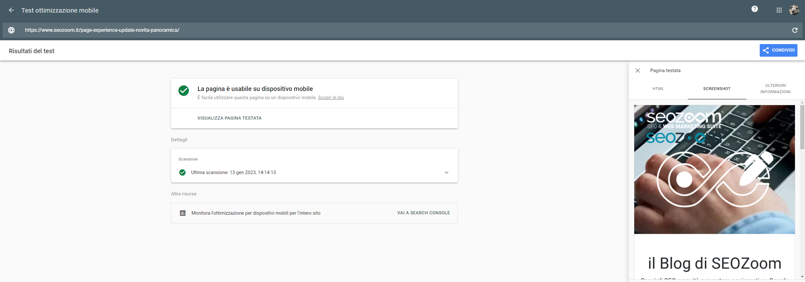
Specifically, the test results include a screenshot that takes a picture of how the page appears to Google on a mobile device, the HTML code rendered for the test page, any JavaScript errors found, and then a list of any other mobile usability issues, i.e., critical issues that may affect the page when visited on a mobile device, such as small font sizes (which are difficult to read on a small screen) and the use of Flash or other heavy technologies (often not supported by most mobile devices). The advantage of this tool also lies in its being available to everyone: in fact, it does not require you to have a Search Console account or be logged in to your Search Console account.
For those who want to learn more about mobile site optimization issues there is Google Search Console itself, which presents another useful tool, namely the Mobile Usability Report, which flags pages in the property that have usability problems on smartphones. Among the reported errors (which can then also let us know what areas of the site need to be worked on) are:
- Presence of incompatible plug-ins
The page includes plug-ins, such as Flash, that are not supported by most mobile browsers.
- Visible area not set
The page does not define a viewport property that tells browsers how to resize pages based on screen size.
- Visible area not set by device width
Page defines a fixed-width viewport property, so it cannot adjust to different screen sizes.
- Content wider than the screen
You must scroll horizontally to view words and images on the page – this happens when absolute values are used in page CSS declarations or images designed to display optimally on browsers of specific width (e.g., 980 px) are used.
- Text too small to read
A significant portion of the text on the page is too small compared to the width of the page, making the text difficult to read on a mobile device.
- Elements that can be selected too close together
Touchable elements, such as buttons and navigation links, are so close together that a mobile user cannot easily touch the element of interest with their finger without also touching the neighboring one.
SEOZoom’s tools for checking and testing mobile performance
SEOZoom also offers some tools to check the behavior of the site against some of the main parameters that refer to optimal technical performance, based on static monitoring on a weekly basis of the values detected by the Google PageSpeed tool.
The Page Speed section of Projects, in particular, allows you to analyze the speed performance of the website’s Home Page, with all the information to improve the responsiveness of the project online thanks to an evaluation on a 100 basis, which you can then deepen from some specific angles.
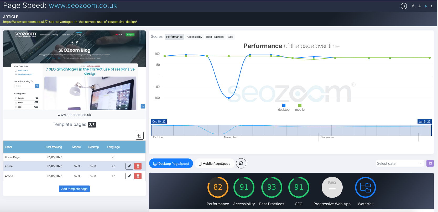
To work on mobile-friendly optimization we can then refer to the “PageSpeed mobile” tab, which focuses the analysis precisely on the mobile version of the site, providing a detailed scan of the performance recorded through Google Lightouse for parameters such as First Contentful Paint, Largest Contentful Paint, Cumulative Layout Shift (which are the three Core Web Vitals) and then again Speed Index, Time to Interactive and Total Blocking Time.
As we navigate the submenu, we will get more information, statistics, and website speed and performance optimization tips to help us see what aspects of the site require action to speed up page loading or improve technical performance.
Mobile sites, the 10 most frequent errors that hinder performance
Milliseconds make millions, and the mobile optimization of a site can determine the success or collapse of one’s business: we have pointed this out so far, and we find further confirmation in the words of Mary Ellen Coe, president of Google Customer Solutions, who urges us to carefully evaluate the usability of a site for users browsing from mobile devices, now steadily the largest share of all surfers worldwide.
The starting point is simple only on the surface: if a slow mobile experience drives readers and customers away, a fast and optimized mobile experience can help attract and retain them.
Let us then recap what are the mistakes to avoid in the strategy, those that put a brake on the performance of the mobile site: we start from three, so to speak, theoretical and basic aspects of approach to the subject, and then move on to a series of problems related to more technical aspects, which go to affect or even penalize the performance of the mobile site and which are frequently committed by webmasters in the design phase of these sites.
- Neglecting the user experience of the mobile site
The first group of mistakes are highlighted directly by Google in its guides for developers and are frequent especially for beginners. Absolutely, what is not recommended is neglecting the mobile user experience, that is, forgetting that the site is to be used by a person in the first place, dwelling only on the technical and theoretical (or perhaps just aesthetic) aspects and not minding the bottom line. On the contrary, a site is optimized for mobile devices when it is really useful for customers browsing with mobile connections and allows them to complete the tasks they want, whether it is reading an interesting article, buying products or inquiring about services and so on.
- Do not use responsive web design and create separate URLs
The second critical factor identified by Google is not really a mistake, but it risks becoming one because it imposes a greater amount of work: that is, not using responsive web design but publishing a desktop and a mobile version at different URLs. Even if Google supports as mentioned different configurations of mobile sites, and therefore technically we are not talking about an error, activating a mobile site on a different domain, subdomain or subdirectory from those on which the desktop site insists increases the amount of work required to manage and update the site and could cause technical problems.
- Do not analyze the market context
The third mistake that Big G highlights in the field of mobile sites is to not look around and analyze the market context: Google’s advice is to visit other sites in the niche, spy on competitors and discover any models to be inspired by and best practices to follow. It is difficult to be the first to have planned and optimized your site for mobile browsing, but you can take advantage of learning from those who have gone before in that particular business segment.
- Serve slow pages
We have said it several times: page loading speed is critical, and from mobile this factor is even more valuable because users can get nervous if the wait to view the desired content is too long. As we said at the beginning, even a millisecond can make a difference, so it is crucial to find out if the pages on the site have problems that can slow them down.
- Not setting the visible area correctly
Another possible error related to user experience concerns the setting of the visible area of the site and, in particular, the failure to specify the viewport meta tag, the element that tells browsers how and to what extent to resize pages according to the device used by the user, to ensure a complete experience of the site. In this regard, there are two problems that people most frequently fall into: using fixed-width viewport areas, which are therefore not designed to resize properly according to the various display sizes that exist, and setting a minimum viewport area of unrealistic width.
This is a more serious error because it requires users using small devices to scroll horizontally through page content to read the full text or to view a photo entirely, and it happens if absolute values are used in page CSS declarations or if images optimized for display on browsers of a specific width are employed. To overcome the critical issue, simply set relative width and position values for CSS elements on pages and verify that images are suitable for resizing.
- Using a font that is too small
Another trivial mistake but one that can cause damage is setting fonts and relative sizes that are unreadable from mobile devices: a font that is too small requires the reader to “pinch” the display to zoom in on the content that interests him or her and read the page, but it is still a cumbersome operation that impairs the user experience. Again, simply provide that the font size can be scaled appropriately within the visible area.
- Clickable elements too close together
A frequent problem that the user may come across while consulting a mobile site is the too-close distance between two or more clickable elements such as links and buttons, with the risk of unintentionally triggering the wrong action with finger presses-a mistake that not only irritates the person, but is also a symptom of less-than-perfect usability. In order to ensure optimized management and proper integration of navigation elements, it is recommended to provide a minimum width for buttons of 7 millimeters (48 CSS pixels) and, above all, to consider the right distance between the various clickable elements, not forgetting that the width of an adult person’s fingertips is about 10 millimeters.
- Content not supported on mobile
Another critical element that can misdirect a user to a mobile site is the inability to properly display certain types of video or content: mobile devices do not widely support Flash or other players, as well as there may be multimedia content constrained by specific licenses and so on. The result is that content works on desktop web pages, but mobile users only see a rather annoying error message.
The advice, also provided by Google, is to use tags in the HTML5 standard for embedding videos or animations, which is compatible with all web browsers and provides a positive experience for all users. In addition, one must choose video embedding that allows for video playback on all devices, and possibly provide video transcription for those using assistive browsing technologies or browsers that do not support playback of proprietary video formats.
- Interstitial ads covering content
It should be clear: For Google, content on mobile pages should be accessible quickly and easily. According to this principle, interstitial or overlay ads, which cover part or all of the content of the page visited by the user, are seen as smoke and mirrors and are a rather serious mistake, which can also cause penalties to the site (considered as a negative ranking factor for Google).

As the advice to developers states, ads of this type are commonly deployed on mobile devices “to promote a website’s native app, mailing list sign-up forms, or advertisements,” but they are unwelcome and unpleasant for the user. In part because “screen space on mobile devices is limited,” and therefore “interstitial ads negatively affect the user experience.”
Therefore, interstitials that appear before the actual content of the page, ads that cover a large part of the text, or “X” to close the window that are cleverly hidden and difficult to find and click on should be avoided. The advice is to integrate interstitials in an appropriate size that does not adversely affect the reading and enjoyment of the page, for example, using a simple banner embedded in the page content or an image or HTML banner to promote the app.
- Robots.txt file blocking scanning
Sometimes it may happen to restrict Googlebot’s access to certain types of site content such as JavaScript files, CSS and images by blocking in the robots.txt file from crawling these resources. This is a technique discouraged by Google because it compromises “the effectiveness of the rendering and indexing of your content performed by our algorithms,” i.e., both the understanding of the site, so to speak, and the analysis aimed at ranking. Instead, the guidelines suggest showing Googlebot the site exactly the way an average user views it, while also using Search Console tools to check, identify and fix any indexing problems present on the site.
