Guide to site fonts, to optimize aesthetics and readability
We may underestimate them, but fonts are one of the main ways to personalize the website and build its overall visual appeal of the domain.Simplifying, we can say that selecting the best font types helps us communicate the right message and establish brand consistency, but most importantly it makes it easier for users to read. And even if there are no direct effects in terms of SEO, in the perspective of building a positive experience it is crucial to devote time and attention to this aspect as well, evaluating different font types to figure out which one is the best for our specific site: choosing a suitable font, in fact, is not always that easy and we can often come across fonts that are visually appealing, but not safe for the Web or vice versa.
What fonts are
A font is defined as a graphic representation of text that appears on a digital page, which can include variations in size, weight, slope, width, and so on. They are not only an aesthetic vehicle, but also a means by which content is communicated to users.
Although we commonly understand them to be synonymous, technically font is different from typeface: typeface is a group of cohesive letterforms, a design style that includes a myriad of fonts of varying size and weight, while font is the way in which the typeface is presented, taking into account size and style. In addition, fonts contain varying numbers of individual symbols, called glyphs, such as letters, numbers, and punctuation, and in some cases also extend to contain ideograms and symbols such as mathematical characters, musical notes, geographic signs, icons, drawings, and more.
To clarify even further, we should more precisely define font as the single letter, punctuation mark or symbol, which can be composed of several glyphs (e.g., uppercase and lowercase), while font is the name that usually encompasses the set of characters and glyphs designed with the same visual coherence and meaning, as well as more technically, the one that identifies the medium that allows a typeface to be applied.
The English word font, used widely in digital jargon around the world, is “borrowed” from classical typographic language and refers back to the term from medieval French fonte, which meant “(something that was) cast,” in precise reference to the method of creating movable typefaces for letterpress printing, produced precisely by pouring molten metal into the form that contained the matrix of the individual typeface.
What fonts are for
If the visual design of a website represents the outward appearance of the company in the online world, and is a topic on which much of the attention is focused at the design stage, there is a danger of forgetting the importance of the published textual elements, which also define the voice of the brand. Tone of voice and quality of content are critical to communicating on the Internet and aspiring to organic visibility, but even the best writing is useless if users do not read the text. That is, it is also necessary to work on what can be a barrier for visitors and specifically-for online texts-optimize the aspects of readability, comprehensibility, and ease of understanding. In other words, users will not read web content unless the text is clear, the words and phrases are simple, and the information is easy to understand.
Very trivially, fonts are the tool by which we are able to read text online (but also on old paper pages!). Managing this element falls under typography (typography), which we can define as the art of arranging letters and text in a way that makes the text readable, clear, and visually appealing to the reader.
Typography involves the style, appearance, and structure of the font, which aim to elicit certain emotions and convey specific messages, and thus “is what brings the text to life,” as Jaye Hannah puts it. By attending to these details, we can work on the visual representation of our brand and communicate in more direct and quicker ways than words alone. Indeed, the fonts used on the site can amplify the brand’s voice, but first and foremost they should make what appears on the screen crisp.
In fact, the first criterion to be met when choosing a font for a site is to make sure that the text on the various pages is clean and readable, conforming to the parameters of accessibility and usability, and then to evaluate the so to speak aesthetic aspects, which concern originality, the visual pleasantness of the fonts, and the need to present oneself in a professional or possibly less formal manner.
Different types of fonts can in fact to add style to a Web page or document, and different fonts are often used simultaneously on the Web to set or match the “tone” of the text according to the content, without forgetting that, as studies confirm, specific fonts affect readability depending on the medium.
Fonts and SEO: why font can affect positioning
What is written also contributes indirectly to the SEO of pages. We should not think of a direct link between fonts and SEO (of the series, “if I use this typeface rather than another I can get a boost in Google ranking!”), but rather a series of benefits on the user experience that can help Google evaluate our site positively compared to that in competitors, particularly in reader satisfaction.
Expanding on this, choosing a font that is readable, easy to scan, and light to load can serve to engage the user more and, potentially, increase their stay on the page and, possibly, encourage their interaction with the site and other pages, consequently reducing the bounce rate.
If, as we often repeat, the basic rule of SEO is that content should not be written just for search engines, but for the human people who read it, making the text immediately understandable and readable is definitely a contributing factor to this process!
In its multidisciplinarity, SEO must take an interest (also) in typography because this branch is much more than just choosing beautiful fonts: it is a vital component of user interface design and, when effective, will succeed in establishing a strong visual hierarchy, provide graphic balance to the Web site, and set the overall tone of the product, guiding and informing users at a glance, optimizing readability and accessibility, and ensuring an excellent user experience.
Not least, fonts can also affect (albeit minimally) the performance of a site, as heavier fonts or excessive use of typographic variants can slow down loading times. In addition, using web-safe fonts or optimizing fonts through techniques such as font swapping can improve a site’s speed, ensuring that there are no obstacles to better placement in search results.
What fonts are: types and styles
Fonts or typefaces can be grouped into three major types-serif, sans-serif, and decorative-which, in different variations (e.g., bold and italic) are also known as font families.
What makes the difference is the aesthetic appearance of the individual typeface and, in particular, the presence of so-called graces: also called sticks or, in English, serifs, graces are special orthogonal elongations at the ends of each letter. The term serif, now also known in the digital sphere (we also often find it in word-like writing programs) is of uncertain origin, but probably derives from the Dutch word schreef, meaning “line” or pen stroke; according to historians, the use of graces derives from Roman lapidary typefaces, where they became necessary because of the difficulty of chiseling ninety-degree angles into marble by hand, which were necessary to terminate the rods.
- Fonts with graces (graced, serif)
Serif fonts – called Roman in Anglo-Saxon circles – have as their main style attribute the presence of graces, the small additional strokes along the edges of letters. Initially used for ink-printing purposes, the style is now associated with a sense of formality and elegance; in the Web sphere, sites often use Serif fonts for the body of text, as they prove highly readable and help readers quickly skim through written content.
Popular Serif fonts include Times New Roman, Cambria, Garamond, Georgia and Bodoni.
Going into more detail, Roman fonts themselves include several groups:
- Old style serifs (such as EB Garamond) resemble ink writing and are characterized by:
• Low contrast between thick and thin strokes.
• Diagonal stress in strokes.
• Oblique graces on lowercase ascenders. - Transitional serifs (transitional serif, such as Libre Baskerville) have:
• High contrast between thick and thin strokes.
• Medium to high x-height.
• Vertical stress in strokes.
• Rounded graces. - Dido or neoclassical serifs (such as Libre Bodoni) have:
• Very high contrast between thick and thin strokes.
• Vertical stress in the strokes.
• “Ball” terminal strokes. - Slab serifs (such as Bitter) are characterized by:
• Heavy serifs with imperceptible differences between stroke weights.
• Minimal or no rounding.
- Graceless fonts (linear, stick, sans-serif)
“Sans-serif” fonts have become the most popular for displaying text on computer screens partly for a practical reason: on low-resolution digital displays, the details of serif fonts may disappear or appear too large.
Also called graceless, linear, or “gothic” fonts (as in various types of font names), sans-serif fonts do not show additional strokes attached to their letters and, in most cases, have letters of similar widths that appear both modern and minimalist. Sans-serif fonts are clean, modern and often neutral-looking, as well as readable at any size, a factor that makes these fonts an excellent choice for print content, digital use and web design.
Among the best-known types of sans-serif fonts we can mention Helvetica, Optima, Calibri (for years the default font in Word and other Office programs), Tahoma, Arial, Verdana and the infamous Comic Sans. There is a small curiosity to be noted: in some series (for example, in the Calibri family) the characters I (capital I) and l (lowercase L) are perfectly identical, while Verdana is an exception and provides a lowercase l supplied with graces.
Characters without graces can be roughly classified into three main groups:
- Grotesque (grotesque, like Work Sans): low contrast between thick and thin strokes, vertical stress or absent.
- Humanist (humanist, as Alegreya Sans): medium contrast between thick and thin strokes, oblique stress
- Geometric (geometric, as Quicksand): low contrast between thick and thin strokes, with vertical stress and round circular shapes
We can then identify at least three other font families, classified according to their design similarities, which mostly apply to particular projects because they are characterized by a very defined style.
Handwriting typeface mimics handwriting and usually features the letters joined together in a fluid, rounded manner; many people associate this typeface with individuality, personal expression, elegance, and calligraphy. Typically, these fonts are recommended for headers, taglines, and blog post titles, rather than for the body of the text, because as a default font it can be difficult to read. This family, which includes, for example, Lobster and Lucida Handwriting, also includes so-called script fonts (more formal, replicating calligraphic writing styles) and pure handwriting fonts (more informal, replicating handwriting).
Then there are decorative fonts (which are characterized by special decorations to various symbols), as in the case of Fantasy fonts (used for fantasy-themed projects, usually in titles, subtitles or banners, because they instantly communicate the genre and allow the audience an immersion in that atmosphere) and so-called monospace fonts. These are fixed-spacing fonts, in which each letter and symbol has the same width: this consistency, combined with the ease of distinguishing characters, makes this font the one generally default for typewriters and computer terminals.
How to choose the best font for your site
As we mentioned in the previous paragraph, there is generally an unwritten “rule” regarding the use of fonts, particularly for the Web.
That is, there is a tendency to use fonts with graces in long passages and thus for the body of the text, for the real content of the page, and to capture the reader’s visual attention by employing a font without graces or even an informal font for headlines.
This is a historical custom that the Web has inherited from printed pages, based on the belief that serif fonts are easier to read in long passages than sans serif fonts – in fact, later studies have not clarified this thesis precisely, suggesting rather that the effect depends more on readers’ greater familiarity to graced fonts (and thus, it is the same traditional usage that creates the rule!). In years past, when the definition of screens was much lower, the use of a modern sans serif font such as Verdana was still widespread, because the absence of graces and the linearity of the stroke allowed for a more defined and thus more readable reproduction, but now we can base our choices on other criteria.
Far more important, for example, is setting a web-safe font for our site, i.e., fonts that are preinstalled on most operating systems and can therefore be displayed as intended by users, regardless of the type of device or browser from which they access the page. By using a web safe font we can be assured that the text will be seen by everyone, with additional assurance given by the ability to indicate a replacement font, shown in any case the base font is unavailable.
The most popular examples of web safe fonts include Arial, Times New Roman and Helvetica: in addition to the features already described, there are also aspects related to superior readability and the ability to reduce page loading times (due to the fact that they are already present in the operating system and do not have to be loaded from web libraries, as is the case with web fonts).
A conceptually similar alternative is that offered by Google Fonts, the free library of Web fonts made available by Google that seeks to simplify the usability of Web pages.
The relationship between fonts and readability
Selecting the best font-or, rather, the type of font best suited to our online project-therefore goes through so many evaluations. In practical terms, what we need to ensure is readability,
According to the most common definition, readability refers to people’s ability to see, distinguish and recognize characters and words in text, and is therefore closely related to (indeed, is determined primarily by) visual design, particularly typography.
Ensuring readability is the first rung on the ladder of content and site usability, and this work: implementing an easily readable font improves the user experience, enabling more pleasant and intuitive navigation.
The main guidelines for ensuring readability are:
- Use reasonably large default font sizes.
- Allow users to change the font size.
- Respect all age (and viewing) groups. Lowercase text compromises readability, but what counts as “lowercase” differs from person to person, depending on their visual acuity, which decreases with age.
- Have high contrast between the characters and the background. It is also preferable to use a plain background rather than an overloaded or patterned one, which may interfere with recognition of the finer details in letterforms.
- Use a clean typeface. According to experts, with today’s high-resolution monitors, serif type is fine, but oddly shaped typefaces (e.g., emulating handwriting or Gothic style) have reduced readability.
Test and evaluate the readability of fonts
To avoid errors and maximize the chances that our texts are actually easy to read, we can make special reference to a special test that allows us to visually check for readability.
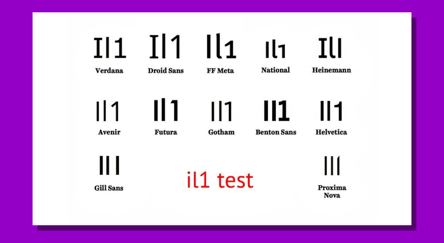
It is called the “Il1 test” (capital I, lowercase elle, number one) and aims precisely to identify the degree of readability of a font by proposing a comparison between these three glyphs, which in some font families can appear practically indistinguishable (as with the Gill Sans MT font), with obvious consequences in terms of ease of reading.
Typography experts distinguish the readability of the font – legibility, determined by the characters in a typeface – from the more general clarity or ease of reading – readability, which expresses how easy it is to read words or blocks of text and is instead influenced by the style of a font.
In this second meaning, to ensure the readability of a text on the web we have to consider some specific factors, such as horizontal and vertical spacing of glyphs, font size, text alignment, visual rendering of semantic tags such as bold and italics, and so on.
Basically, we can say that it is generally preferred to set proportional horizontal spacing (in which the width of a font is variable) with well-defined vertical spacing or line spacing, so as to leave room for white, which ventilates the text and makes it easier to read without straining the eye.
More critical, perhaps, is the management of font size, which likewise affects the readability of text on the Web: our style requirements have to “come to terms” with the more concrete needs of users, who often visit online pages from mobile devices with small displays that do not make it easy to view very small fonts.
An industry standard is to set a font size between 12 px and 14 px, so that phone and desktop users can easily read any type of text, but we can also increase to 18 px or 20 px, which are much easier to read on any device. Also because when a potential customer has difficulty reading the text on the website, they are likely to leave and look for similar content elsewhere.
Finally, font color can also make a difference in a positive (or detrimental) way for readability: the basic advice is to set a color that is aesthetically pleasing without being overpowering, that respects the personality of the brand, and that contrasts sufficiently with the background color of the page, thus being easy for people to read.
How to use fonts on the site
We then come to some considerations and practical tips for using fonts on our site.
To keep the interface uncluttered and streamlined, web design best practices call for never using more than three different fonts throughout the site, keeping decorative fonts to a minimum; for example, an alternating combination of serif and sans-serif fonts for main body and titles is preferred in most.
The general rule of never using more than three fonts on the website serves not only to improve design, but also to limit the number of fonts to make the site more accessible and not overload performance.
In addition, each font should have different levels of hierarchy, to be respected on the various pages, which will then have us set a main font, a secondary font, and a more distinctive optional font.
The main font is obviously the most visible one, to be used preferably in the headers of the site: it can be more dominant and distinct than the others because it will be the one most associated with the brand (even if it is not the most present on the site in terms of quantity).
In fact, the palm of most-used font goes to the secondary font, which is the one used for most written content, such as paragraphs, descriptions, blog articles, and more: for this reason, it must be absolutely readable, because overly elaborate styles are harder to read, especially when applied to long blocks of text. As mentioned, fonts do not directly affect SEO, but they can still influence how customers choose to interact with our business.
Finally, the third font is the one that should be used only for a very specific purpose and, speaking of Web sites, for call-to-actions: it should be a distinctive font that draws attention to the most important button on the page, and it is often recommended to use the brand logo font.
After choosing the font scheme, we need to set different letter sizes for titles, subtitles, and large paragraph text. A possible range of values is the following, which can be applied to most sites:
- Headings: 30-70px
- Subtitles: 22-30px
- Paragraph: 16-20px
It would also be wise to adhere to the standards set throughout the site, making titles, subtitles, paragraph text, and more consistent in font, size, and weight at all times.
What is the best font for online reading
Ultimately, then, what font should we use for our website? As is often the case in digital marketing and SEO, the answer is “it depends” because there is no single answer to this question, as also confirmed by a recent study launched by Adobe and summarized on the Nielsen Norman Group blog.
The test involved a sample of more than 350 participants who were given text passages displayed in 16 different fonts, including classic typefaces (Times, Helvetica, Garamond), typefaces designed for computer use (Calibri, Arial) and typefaces designed specifically for readability (Noto Sans, Montserrat).

Specifically, experts collected data on three metrics, namely:
- Subjective user preference, i.e., which font each person liked best.
- Reading speed in words per minute (WPM, words per minute).
- Comprehension score, the percentage of questions answered correctly after reading a passage.
The results of the best font test
As shown in the next image, the test identified the font with the highest overall WPM score: Garamond is the font with the highest average reading speed at 312 WPM, 6 percent better than the second (Oswald, at 295 WPM) and 23 percent better than the worst font of the 16 tested (Open Sans, at 254 WPM).

However, the analysts pointed out that Garamond is only the best on average and is not the best choice for all users, because there are (and weigh) substantial individual differences: for example, many users read faster with a font other than Garamond, which means they would be penalized by a design using Garamond.

And so, in the final analysis, the study does not venture to define what is the best font for a site (the variables are too many and subjective), but still presents us with some considerations that we need to keep in mind when choosing. In particular:
- Even among fonts with good readability, reading speeds differ substantially, so it is really important to look for the best font.
- Unfortunately, no single font is the best for all users.
- We cannot ask users to choose their own font, because people will not choose the best font for them.
- Reading speed decreases substantially with age, especially after middle age.
- There are age-related differences in which fonts are best, and as early as age 35 can be a discriminator.
- There are no bad fonts (partly because the study did not look at the most extreme fonts), but there are certainly fonts with low readability, which can reduce reading speed. But even good fonts can make reading worse, if set with tiny text and low contrast, and do a lot of damage.