
Five tests to improve the user experience of the e-Commerce site
The evolution of mobile devices has completely revolutionized the web industry: it may seem trivial to say so, but looking at some statistics related to e-commerce sites you understand that there is still a lot of work to do, especially in terms of mobile user experience. Only by offering a positive overall experience to potential customers, in fact, you can improve the conversion rate and keep up with competitors, especially with the start of the Page Experience Update: and from Google comes a guide to the optimization of the user experience from mobile, using A/B tests to improve the ROI of the media campaigns.
The importance of mobile
It is an article by Elisa Paravidino, UX & Payment Specialist for Google, to shed light on the opportunities (and limits) of mobile optimization of e-commerce sites, starting from a certain fact: for at least three years now, the access to the internet from mobile has exceeded the one from desktop in Italy, as well, with over 33 million active users from mobile.
The coronavirus pandemic has further accelerated online purchases, as we said in recent weeks, and therefore the importance that online stores must attribute to the mobile version of their site becomes even more evident.
The limitations of mobile e-Commerce sites
Despite the significant growth in mobile traffic, however, we do not see a similar level of increase in conversions, which often still take place on desktop: according to Google’s analysis, this depends on many factors, such as the preference of users to buy from desktop, but also by the lack of attention that many companies give to mobile in their strategy.
For example, a bad UX frequently drives away potential customers, and it is estimated that in general 3 out of 10 people who have started looking for something to buy online end up leaving the cart; a figure that from mobile is even higher, because even stronger is the process of discovery and product selection that we have called messy middle.
There are three main limits that hinder mobile conversions, that is the problems that most often harass customers of e-commerce sites:
- Scrolling stress
The vastness of the options, and the need to scroll down with your finger numerous times to find the perfect product, is a high source of stress, especially in the Exploration phase
- Form compilation
Automatic compilation that does not work is another critical element, because it is neither comfortable nor pleasant to fill a tiny form on a small screen.
- Site speed
Even a small fraction of a second delay can become a stumbling block for users of a website, especially from mobile: obstacles cause frustration, and when a customer finds them in his path it will hardly continue until the final stages of payment.
There is therefore still much to do to offer users a comfortable and easy navigation, that makes them feel at ease while browsing and buying online: the UX mobile, and therefore a fluid experience and full of reassurances, is at the base of the buying and positioning process, as foreseen by the new Google ranking factors.
How to improve the browsing experience to maximize mobile conversions
The Google article therefore gives us useful guidance to improve the browsing experience to maximize conversions on mobile devices using the A/B tests and, in particular, implementing a strategy based on continuous testing in order to achieve the best return on investment (ROI) of media campaigns.
A/B tests to optimize the mobile experience: the Calzedonia case
Paradivino tells the results of a year-long collaboration between the team of mobile specialists at Google and the Italian clothing company Calzedonia, which has identified some operational best practices and optimized all the sites of the group.
The work focused on 3 sites of the group – Calzedonia, Intimissimi and Tezenis – which already saw a preponderance of mobile traffic (percentage between 70 and 80%, depending on the brand), but they found much lower and variable percentages of mobile revenue (from a minimum of 30% to a maximum of 60%).
From a methodological point of view, the team began to intervene on Tezenis, the youngest brand in the group and the one where the percentage of traffic was most unbalanced towards the mobile; after a careful analysis of the UX of the mobile site, The Google Optimize platform was used to set up a series of checkout tests.
At the end of this phase, in light of the excellent results and ease of implementation of the method, the company has extended the work on the sites of Calzedonia and Intimissimi. And so, after a year of working together, for all three brands involved in testing there was a constant improvement in the mobile conversion rate, which proves how “small improvements in the mobile experience can really bring important results for revenues”.
5 practical tips to optimize the mobile UX
The work with the sites of the Calzedonia group has allowed to derive some useful insights on the possible strategies of optimization of conversions from a mobile site and confirmed as good practice the use of A/B Tests to understand and identify the elements that can do the difference for your customer segment.
In particular, Google has identified 5 best practices from which you can start towards this fundamental goal for e-commerce.
- Main categories in home page
The simple choice of inserting the main categories into the home page has led to both an increase in conversions and total turnover, as it has made the categories easier to find.
In practical terms, the categories to be highlighted have been chosen among the most popular ones by analyzing Google Analytics data, and this has impacted further the increase in conversions.
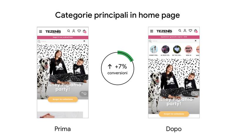
On Tezenis Italy, for example, there was an increase in conversion rate of 8% and an increase in conversions of 7% after updating the home page to add categories.
- Search bar in home page
Another graphic element seemingly simple, but able to affect a lot, is the presence of the search bar in the home page, which was absolutely “the test that generated the highest increase in conversions and sales”11% and 15% depending on the country.

According to Google, the data is not surprising because “users who use search within the site tend to buy more often”. The practical advice is therefore to always show the search bar, especially on a site with a large catalog products.
- Images in the hamburger menu
Even the hamburger menu (the typical menu that is used in mobile sites with 3 lines that resemble, in fact, a hamburger) is a useful element to ease understanding and conversions: A practical system to further improve its ability to simplify and make navigation more fluid is the insertion of images within the main menu, which help navigation and have a positive impact on conversions.
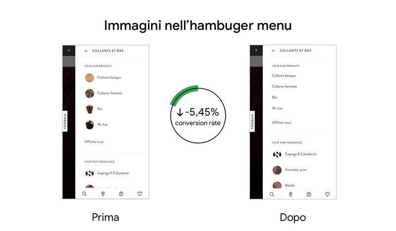
The experiment showed that on Calzedonia France, for example, the removal of images in the hamburger menu led to a decrease in the conversion rate of 5.45%.
- Descriptions of the most relevant products
Users (still) search for textual information and a good product description can make a difference.
Prior to the collaboration with Google, Tezenis had developed product pages in which it gave great space to images, leaving hidden the description of the single product, visible only by clicking on “Description”.
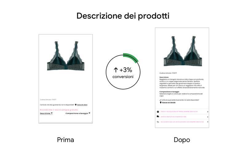
Tests have shown that a detailed description of the always visible product has a positive impact on conversions, which in this case was 3%.
- No surprises in the cart
Checkout is the most delicate phase of the purchase process, as we said also talking about heuristic evaluation and Google’s tips to optimize e-commerce sites.
A research by Statista indicates that 82% of the purchase paths in retail stops at the cart. The reasons are varied and include surprises in shipping costs or the use of the cart, by the customer, as a wishlist to compare prices. On the other hand, the perceived lack of security is not the main reason for the abandonment of a trolley, whereas such research in 2015 identified a determining factor.
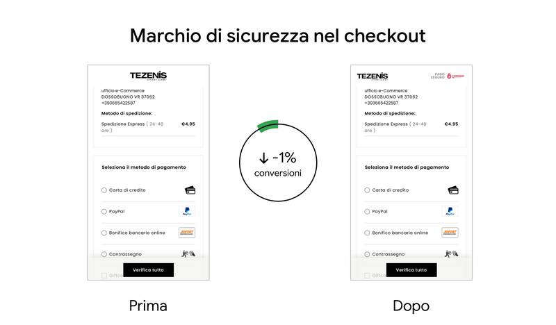
Google still wanted to test this aspect and, with the brand Tezenis, has experienced the addition of a security mark in the cart: the effect was surprising, because the inclusion of this element has had a negative impact on conversions and demonstrates “that every assumption must be tested and, above all, that the needs of those who browse our site change with time“.
