
Cumulative Layout Shift: what it is and how to optimize the metric
It is a frustrating experience to say the least: we start reading online content when, all of a sudden, the page skips like hundreds or thousands pixels and makes us completely miss the point we were at, or maybe we try to tap on a button and a popup appears in its place that we involuntarily press, taking us to an unwanted page from which we desperately try to go back. These are two examples of (terrible) layout shifts, that can cause difficulties to the user experience: it is no coincidence that Google has included the Cumulative Layout Shift among the metrics of the Core Web Vitals, and now guide us to measure and optimize this metric to improve the use of our pages.
What is the CLS, Cumulative Layout Shift
Cumulative Layout Shift (CLS) is a metric of Google that measures visual stability through the analysis of an event of the user experience, or the unexpected shift of the elements of the web page while the same is still being uploaded.
It is one of the three Core Web Vitals that will be ranking factor on Google from 2021, as announced in early June: it is therefore an element with which to deal in order to have a performing site and ensure a positive user experience,by complying with the indications and desires of the search engine, since it is also part of the ranking signals evaluated as part of the Page Experience.
Unlike the other two Core Web Vitals – Largest Contentful Paint and First Input Delay – its reference unit is not time, but space, and Google has created a specific score to identify the level of layout variations during page loading, which can compromise the user experience.
The issues with the layout variations
The CLS occurs when the content of the page moves without the user’s voluntary input or prior notification: the onpage elements that tend to cause variations are characters, images, videos, contact forms, buttons and other types of content.
In the most common case, the user who is visiting the page is ready to click on an element, but in the meantime the loading modifies the position and leads the person to “make a mistake” and click on something else, often even an ad or a pop-up window.
Cumulative Layout Shift or CLS: what this metric means
The in-depth analysis is curated once again by Patrick Kettner, Google’s Developer Advocate, who ran a series on YouTube devoted specifically to techniques for optimizing Core Web Vitals.
Regarding CLS, Kettner says that this parameter helps us understand how stable a page is or, more precisely, how predictable the use of a page is.
All the visible parts of a page and the way they fit together, Kettner explains, are what a browser considers a layout – images, text, videos, everything. When the content of a page changes, for example when an advertisement is inserted, a widget is loaded, or an image is changed in size, Sometimes things that are already visible on the page end up being moved elsewhere to make everything fit and “every time this happens there is a change in layout“.
The cumulative layout shift is thus a way of determining how much of the visible parts of a page, in percentage, experience these variations in layout.
Examples of CLS and the most problematic cases of issue
To better understand what the Cumulative Layout Shift is – and how annoying it can be – just watch this short explanatory Google video.
As you notice, the user wants to click the button to vary the order, but the sudden and unexpected appearance of a pop-up modifies the layout of the page and moves the items lower than the previous position. So, the tap that would first end up on the “no” actually lands on the confirmation of the cart, causing a frustration (and probably also quite a lot of nuisances and irritation).
Another type of problem may occur when reading an article: instead of allowing the operation to be completed without interruption, the text or other elements change and the user loses the visual reference of his reading, having to shake the page to find the paragraph he was actually at.
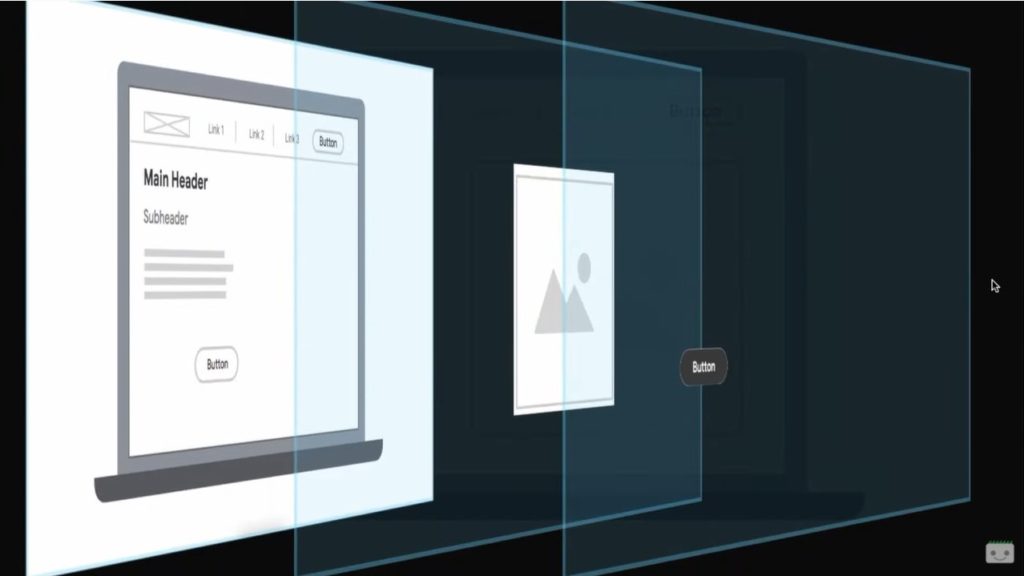
In the video, the Googler also brings the example of a simple blog article, which shows on page a title, a main image and text. For users who browse from a slower connection, the text appears right away, but the image takes a little longer to appear, although eventually it will be downloaded and opened.

However, before the pixels of those images can be painted, some changes may be required.
As for the browser, everything that is above the image is in place and you do not need to change anything, but in order for the image to appear in the place and the way it was conceived, everything below it must move down to make room for it.
The importance of Cumulative Layout Shift for SEO and UX
“Most of the time these types of experiences are just annoying, but in some cases they can cause real damage”, write Philip Walton and Milica Mihajlija on web.dev, adding that “a low CLS helps to ensure that the page is enjoyable” for users.
Minimizing this parameter is therefore important because moving pages can cause a poor user experience, and the problem is even greater on mobile devices, because smartphone screens are smaller and the impact of variations is more intense.
A poor CLS score is indicative of coding problems that can be solved.
Causes of the CLS
According to the Googlers there are five reasons why a cumulative variation of the layout occurs:
- Pictures or videos of unknown size / not set correctly.
- Ads, embeds and iframes without dimensions.
- Injected content
- Web fonts that cause FOIT / FOUT
- Actions waiting for a network response before updating DOM
Thus, unexpected shifts may occur “because resources are loaded asynchronously or DOM elements are dynamically added to the page above the existing content“, but they may also be responsible for “an image or video with unknown size, a character that becomes larger or smaller than its fallback or a third-party ad or widget that dynamically resize itself”.
What makes these factors even more problematic is that the way a site works in development is “often quite different from how users experience it”: for example, personalised or third-party content may not behave in the same way in development as in production, test images are usually already in the developer browser cache and the API calls that are run locally are sometimes so fast that the delay is not blatant.
Cumulative Layout Shift of a page, Google’s tips
Quindi, il testo dell’articolo viene letteralmente spinto in basso per metà della quantità visibile della pagina per fare spazio all’immagine: ciò significa che il 50% di ciò che possiamo vedere inizialmente deve essere spostato solo perché l’immagine appaia, e quindi il CLS sarà 0,5 – ma solo se nient’altro si sposta sulla pagina o se l’utente esce dalla pagina prima che qualcos’altro modifichi il layout, perché altrimenti il CLS sarà peggiore.
In sostanza, pertanto, il punteggio CLS di una pagina indica quanto cambiano le parti visive della stessa, ma Kettner ci spiega che ci sono alcune precauzioni e aspetti da non trascurare.
- There can be only one CLS score
Each time someone visits the site, the browser will continuously track the CLS throughout the time of use, and when the user leaves the page or closes the tab will report the greatest CLS value found. This single number is collected with that of all the other visitors to that URL and generates the CLS value for the vitals Web on that page.
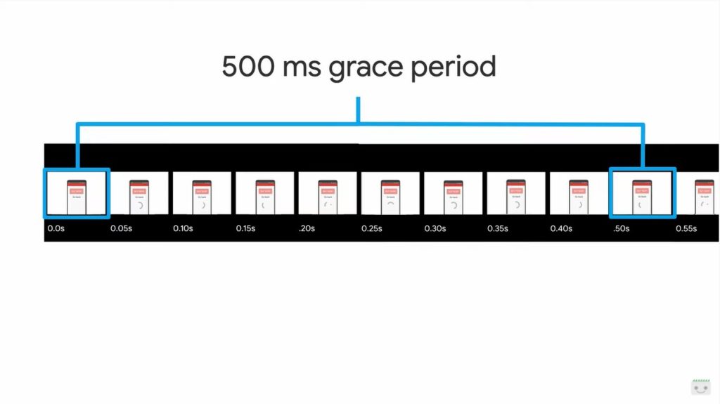
- Sometimes change is positive
“If pages never change, they wouldn’t be so useful,” Kettner explains: some layout changes triggered by user interactions – things like touching, clicking or typing – have a grace period of 500 milliseconds in which to perform any layout change they need to best respond to that user. After these 500 milliseconds, a new CLS session window begins: from the 501 millisecond onwards, any content shift that occurs is added and potentially used for a final CLS score, and this session window will remain open as long as there are visible layouts that are moved.
Any additional movement is added together: for example, another page of our site has a basic layout, with a title and a body of text, but this time has two smaller images that, as in the previous case, are slow to load and move the content when they appear. The first photo moves the layout only by a small amount, by 5% and then its CLS would be 0.05, but the second image is loaded several hundred milliseconds later and needs some space, pushing the content even further down, for a visible quantity of 2,5%. These two events take place in close times and therefore the variations are accumulated in a single CLS value, which is 7.5% or 0.075.
The session window, in fact, remains open until more than a second has passed since the last layout shift, or until five seconds have passed since the creation of this session window: any subsequent layout change is counted as a separate event and not added to the previous window.
- Not all interactions are free
User interactions such as scrolling or mouse movement do not count as the type of events that open the grace period of 500 milliseconds, because in fact “a user cannot expect the layout of a page to move while it is scrolling”.
- Not all changes are negative
It is possible to freely move the content of the page at will via animations and CSS transformations.
By setting a CSS attribute as transform, the element is moved to a specific layer and its position does not affect the layout of any other part of the page, but “it is as if it were floating on top of everything else” and does not count for the CLS.
- What we cannot see cannot hurt us
The CLS only applies to the visible elements of the page and, for this metric, “it doesn’t matter if something moves that you can’t see”. Respecting the philosophy of the Page Experience, the CLS serves to ensure that people have the best possible user experience: therefore, we can move something or put content in lazy loading “if it is not visible to the user” and without influencing the CLS.
What the CLS measures
The CLS metric “measures the total sum of all scores of individual layout shifts for each unexpected layout shift that occurs during the entire length of the page”: a change in layout occurs whenever a visible item changes its position from one frame to the next.
To provide a good user experience, sites should try to have a CLS score of less than 0.1 and “to be sure to achieve this goal for most of your users, a good threshold to measure is the 75th percentile of page loads, segmented on mobile and desktop devices”.
Layout variations are defined by the Layout Instability API, which reports layout-shift entries whenever an element visible with the viewport changes its initial position between two frames; these elements are considered unstable.
How Google calculates the Cumulative Layout Shift score
To calculate the score of layout variation, the browser examines the size of the window and the movement of unstable elements in the window between two rendered frames.
In practical terms, the CLS score is the product of two measures of that movement: impact fraction and distance fraction, translatable as a fraction of impact and fraction of distance, which take into consideration the percentage of the browser screen affected by the layout changes.
What is the impact fraction
The first parameter measures the impact of unstable elements on the area of the window between two frames and then takes into account the area of the browser screen affected by changes in the layout.
The fraction of impact for the current frame is given by the merging of the visible areas of all unstable elements for the previous frame and for the current one, as a portion of the total area of the window.

The image helps to better understand: an element occupies half of the window in a frame; in the next one, the element moves down 25% of the window height. The red and dashed rectangle indicates the union of the visible area of the element in both frames which, in this case, is 75% of the total view, so its impact fraction is 0.75.
We can say that the fraction of impact measures the total space that the element of a window has occupied, from the position it has in the view when it is displayed for the first time up to the final one, at the end of the rendering of the page.
What is the distance fraction
The other part of the CLS scoring equation measures the distance vertically and/or horizontally that unstable elements have travelled in relation to the window; is calculated by dividing the longest distance travelled by an unstable element moved in the box by the largest size of the window (width or height).

Again, the visual example helps to better understand the value: the larger window size is the height and the unstable element has shifted by 25% of the window height, which makes the fraction of distance 0.25.
Initially, the CLS only considered the impact fraction, but then Google decided to introduce this second factor to avoid excessively penalizing cases in which large items move by a small portion.
The definitive score of the CLS
In the given example, then, the overall layout variation score is 0.75 * 0.25 = 0.1875, given by multiplying the number of impact fractions (0.75) and that of the distance fraction (0.25). As said, for Google a CLS score is considered good when it is less than 0.1
CLS scores: how to measure them and which ones are the good values
There is one key thing to remember: a good CLS score means that what the user sees is stable and predictable and that it is not jumping all around.
From a practical point of view, the CLS is represented by a number between 0 and 1, with the 0 representing the perfect score “in an ideal world” because, for the Googler, “there is almost never any need for a layout shift and we can almost always prevent them”; however, in the real way “we all have a job and our sites are facing tons of different concerns”.

So, if reaching 0 is almost impossible, “a very good number to bet on is 75% or more of the views on a page that has a CLS of 0.1 or less,” says Kettner. If we manage to stay below this threshold, the pages offer a stable visual experience, while if we exceed those values there are some methods to improve the situation and reduce the CLS.
Layout variation and their impact on user experience
The in-depth analysis of wev.dev shows with other examples such as the adding of content to an existing element affects the score of the layout variation.

In this case, the “Click Me!” button is added at the bottom of the gray box with black text, which pushes the green box with white text down (and partially out of the view box).
Even if the gray box changes in size, its initial position does not change and therefore is not considered an unstable element. On the other hand, the button was not previously in the DOM and thus does not even change its initial position.
To change is the initial position of the green box: as it has been partially moved out of the viewport, the invisible area is not considered in the calculation of the impact fraction. This means that the union of the areas visible for the green box in both frames (illustrated by the red and dotted rectangle) is equal to the area of the green box in the first frame, that is 50% of the window. So the impact fraction in this case is 0.5.
The distance fraction is illustrated with the purple arrow: the green box has moved down about 14% of the window, so the distance fraction is 0.14.
The score for layout variation is therefore 0.5 x 0.14 = 0.07.

Adding other non-fixed elements makes the situation even more complicated. In the first frame above there are four results of an API request for animals, sorted in alphabetical order; in the second, more results are added to the ordered list.
The first element of the list (“Cat”) is stable and does not change its initial position; the new elements added to the list were not previously in the DOM, so even their initial positions do not change, but the objects labeled “Dog”, “Horse” and “Zebra” change their starting position and are therefore unstable.
The red and dotted rectangles in the image represent the union of these three unstable areas before and after, which in this case cover about 38% of the window area (and impact fraction of 0.38). The arrows represent the distances that unstable elements have travelled from their initial positions. The “Zebra” element, represented by the blue arrow, is the one that has moved the most (about 30% of the window height) with the fraction of distance in this example of 0.3.
The score for layout variation is 0.38 x 0.3 = 0.1172.
Expected and unexpected layout variations
Not all layout shifts are negative, point out in the article Philip Walton and Milica Mihajlija, and many dynamic web applications often change the initial position of the elements on the page.
Only unexpected layout changes are wrong and problematic for the user, while generally good are changes that occur in response to user interactions (clicking on a link, pressing a button, typing in a search box, etc.), as long as the move is done quickly and consequentially to the interaction, making clear the cause-effect relationship for the user.
If not – if, for instance, a user interaction triggers a network request that may take some time to complete – it would be better to immediately create some space and show an upload indicator to avoid an unpleasant shift of the layout to completion of the request. If the user does not realize that something is loading or has no idea when the resource will be ready, he might try clicking on something else while waiting, something that might then move to the end of the first action started.
According to the Googlers, animations and transitions – if well executed – “are a great way to update the page content without surprising the user”: the content that moves suddenly and unexpectedly on the page almost always creates a bad experience for the user, but content that moves gradually and naturally from one location to another can instead help the user to better understand what is going on and guide him through status changes.
How to measure the site’s Cumulative Layout Shift: field tools and lab tests
We now come to some practical and useful information to verify the performance of our site and our pages: the CLS can be both measured in-lab or on the field and is available in various tools.
Among the field tools are Chrome User Experience Report, Pagespeed Insights and the Google Search Console with the new Core Web Vitals report.
Among the lab tools, instead, we have Chrome Devtools, Lighthouse and Webpagetest. These lab tests simulate the behavior of the site when a real user downloads a Web page: Google uses a Moto G4 smartphone to generate the CLS score within the lab environment.
But we must remember that lab tools – which are ideal to understand how a layout can be executed before sending it to users and offer publishers the opportunity to test a layout to find out any problems in advance – typically load pages into a synthetic environment and thus are only able to measure changes in layout that occur during page loading. As a result, the CLS values for a given page reported by such tools may be lower than those experienced by real users in the field.
The easiest way to measure CLS (and all the metrics of Web Vitals fields) is with the Javascript web-vitals library, which wraps all the complexity of CLS manual measurement into a single function.
CLS measurement methods
Kettner goes into even more technical details, when reminding us of the fact that, as with all Core Web Vitals, the CLS indicates “what real users are experiencing when using our site”, showing information that is defined as field data, which you can find in personal analytics or metrics within the Core Web Vitals section of Search Console.
Console search, factors for the Page Experience and Core Web Vitals all have the same source for the CLS outcome of the pages, namely the Chrome User Experience Report or CrUX, which presents anonymized metrics on the performance times encountered by actual users visiting the site Urls.
By its nature, Crux does not update instantly and “may take up to a month to publish the page to begin to sound data in the field”.
Luckily, you don’t have to wait that long to get an idea of how CLS behaves on the page we’re working on, because we can use tools like Google Lighthouse, that quickly provides the same field data that we have in Search Console for any page or allows you to generate lab data.
Laboratory data is an “attempt to guess in the most likely way how the field data will be”, are based on average mobile devices and the average speed of the Internet from mobile; however, remain a hypothesis, may be useful to point us in the right direction but “field data is the only value that the experience on the page, and therefore the Search, will actually look at”.
For example, if our users have high-end devices or unusually slow connections, there is likely to be a strong differential between laboratory and field data values.
The analysis of CLS with Javascript
Lab data can be really useful, says Kettner, but after actually publishing the page is “a little more useful to actually collect CLS data through our analytics“, and in particular through the measurement with JavaScript through the performance observer also used for other metrics.
Performance Observer is a relatively new API browser that allows you to subscribe to events happening in the browser related to performance.
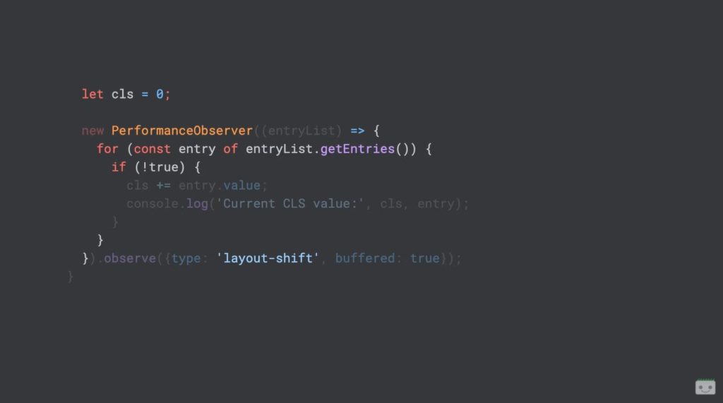
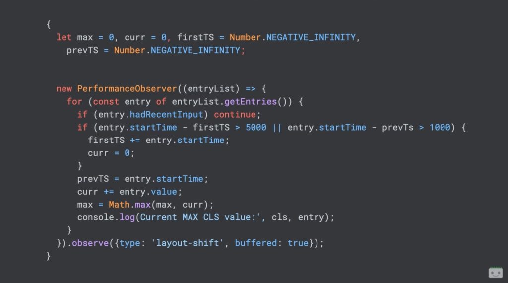
We do not have the ability to directly observe the cumulative layout shift value, but “we have all the right pieces we need to find out for ourselves”: the first step is to subscribe to the performance event “layout shift”, so that our code is called each time the browser has an event to change the layout and understand how the CLS will be for this user.
When our feature is called, it gets an entry list of each layout variation that has been observed: we can call Get Entries on this entry list to get an array of entries to be repeated on each individual entry, and then again check if an entry had a recent input (HadRecentInput, a convenient property provided by the browser on each shift entry layout).
If “HadRecentInput” is true, then we are in that first window of grace of 500 milliseconds and we can ignore this entry; on the contrary, if “HadRecentInput” is false, we must take entry.value and add it to our CLS.
Originally, the CLS was calculated by summing up the entire session of a page, but as a result of the feedback received and the continuous evolution Google changed the metric and chose to use the methodology of the session window – we talked about it here, as well. To calculate the CLS to the extent it is intended today we must then add other variables to our JS code, as shown in this image.
Now that we know how to collect CLS value, “we still need to trigger an analytics event“, but the way we do it depends solely on our infrastructure, while the when applies to everyone.
The browser has another event, called visibility change, which is activated every time the visibility of a page changes, such as when it is reduced to an icon, closed, or you browse elsewhere (in another tab or window, for example) and allows us to expand our code to include reporting.
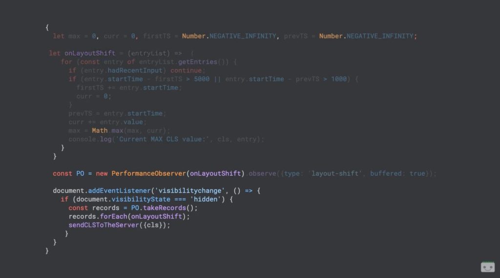
If the visibility status is hidden, we can call take records on our Performanceobserver: we will then have a list of all the entries that were not processed by our code, and we can then process each entry just as we normally would, to then call sendCLSToTheServer – a completely invented function that we have to implement to make it work on our site.
The only weirdness left in our code, continues Kettner, “is that to ensure that the CLS is always sent when people leave the page, we are using the visibility change event”, which potentially risks sending more analytics events to the same user (for example, a user who has our page open, but then changes tab, and goes back, and then again, and again, sends more events to the server each time the change takes place).
Therefore, you will need to filter these values on the back-end to get the greatest value for each user session, remembering as said that there can only be an Cumulative Layout Shift value.
How to optimize and improve the CLS
For most websites, you can avoid all unforeseen layout changes by following certain guiding principles, such as:
- Always include size attributes on images and video elements, or reserve the required space with something like CSS boxes.
This approach ensures that the browser can allocate the correct amount of space in the document when uploading the image.
Moreover, it is also possible to use unsized-media feature policy to force this behavior in browsers that support feature policies.
- Never place contents above existing ones, except in response to a user interaction. This ensures that any layout changes are expected.
- Prioritize the transformation of animations into property animations that activate layout changes. Animating transitions will provide context and continuity from one state to another.
How to improve CLS scores
To improve the value of the Cumulative Layout Shift we must first understand what causes negative variations to the user experience and, according to the video, these layout changes “can be traced back to a handful of causes”such as images that do not have inline dimensions, iframes or embed that do not have inline dimensions, dynamically injected content that does not preserve space with explicit dimensions and finally web fonts or icon fonts that cause a flash of unsharpened or invisible text.

Layout shifts: the most frequent causes of issues and how to solve them
Images are the main source of problems with CLS, says Kettner.
Remembering the above example, an image that does not include a width or height attribute, either in line or with its own CSS, should actually be just a placeholder note, something that is completely different from the size it will have at the end of loading, and that causes the content to jump, triggering a displacement of the layout.
The solution to this problem is very simple: explicitly include the height and width attributes of our image. Such “attributes have existed for decades and inserting them was a common practice, but with responsive designs and high-definition screens setting these values has become less useful than using CSS or letting the browser understand them by itself”.
Currently, all modern browsers make automatic sizing of the resource based on the aspect ratio (aspect ratio), that is how wide an image is divided by how high it is according to the values of width and height. This means that “we can still model the image using reactive values such as width 100% in our CSS”, but at the same time the browsers automatically reserve the correct height based on the aspect ratio of the width and height that we provide.
In addition to being a good solution to manage the appearance of images on all devices, this will also prevent images from triggering the CLS, because you will not see changes in layout, even if the image is loaded on a slower connection.
Another critical front are iframes and embed, which “can mean a lot of different things like advertising slots or widgets for a video player”; in practice, anything we upload from another domain or other services is likely to be loaded into an iframe or embed.
We cannot control what happens inside the iframe, says the Googler, but we can control what happens around it: just like our images, we need to reserve a space that will be occupied by the iframe. By setting explicit heights and widths for the iframe parent element, the browser reserves space for it, thus preventing any layout shift.
Sometimes, the ad network that provides ads for the site does not need the right size for its slot, which could be too large a couple of pixels: Kettner therefore recommends explicitly setting Overflow Hidden on such parent container iframes to make sure they do not exceed the measurements in an unexpected way. But if we need to be sure that every single pixel of an ad is visible, we need to oversize the parent container slot and modify our design accordingly to take it into account and make it look good even if the size is larger. In addition, it is also useful to avoid collapsing advertising slots when no ads are returned, because the removal of all that space will cause as many annoying variations in layout.
Not all dynamically uploaded content is in iframe, though: if our site has a list of articles or pages of endlessly scrolling products, or if we simply put any kind of content in lazy loading, We must always be sure to reserve the space that will serve with an explicit height and width.
Just like with iframes, if all goes well the server should return something of this size, but theoretically “our pages are designed so as to be flexible enough to handle content larger or smaller than expected”.
And so, set a flexible but immutable width and height and height on the remote resources of our page “is the key to a minimum CLS score”.
Management of web fonts for the CLS
The above examples of potential causes of high CLS can be solved simply by “making sure that all rectangles have explicit dimensions that do not change“, Kettner summarizes, but what if the content within those rectangles changes?
This is why web fonts pose a unique challenge to CLS, because we can’t explicitly set a width or height on text, and so to solve the problems of a web font or font of icons that cause the layout to move, we need a different approach.
The simplest solution is not to use the font. In the case of icon fonts, it is actually much better to directly use SVG today, because “not only do they have a significantly improved design capability, but they give much less problems in modern browsers and are also substantially better for accessibility“.
But if a web font causes the layout variation and we absolutely want to use it, then we need to optimize the way the font is loaded. In short, a great starting point is to use the preload for all the fonts we are really using: usually, web fonts are loaded asynchronously (lazy load) and then the browser downloads HTML, any Javascript and CSS before starting to download and process each font face declaration that we declare within that CSS. Link rel preload is a kind of suggestion that we can give to the browser to get it to start downloading the font before it finds out in the normal way, so that it will be ready much faster when it is discovered.
In addition, these essential fonts must be put as close as possible to the top of the page, to give the browser as much time as possible.
Instead, if we choose the web font for an aesthetic issue, we can alternatively use font display: optional, a property that we can set in a font face declaration, which supports some different values and which, optionally, tells the browser that the font is, in fact, optional. In practice, setting this value, if the web font takes more than three seconds to load the browser will give up trying to load it, and will only show anything that has already been rendered. So, no more changes, no more movements of content.

When we are already looking at a font-based code, we have to check that we have not already used font display: swap, which does more or less the opposite of optional: font display swap tells the browser to immediately show any existing fallback font and then replace it with the font we are requesting as soon as the download ends, regardless of the time it takes to download it.
If we use a web font that is slow to load onto a substantial part of your page, “we can imagine how big your CLS score can be if we use the font display swap”, Kettner concludes.
