Best practices to manage the image carousel on the site
It is one of the most used components to offer visual impact content to users who arrive on a web page, but if not correctly implemented and managed risks causing a slowdown in performance and negatively affect the accessibility of pages. We must therefore pay close attention to the image carousel and learn how to manage it at its best, to set up an effective slider that conquers visitors and does not ruin their browsing experience.
What is image carousel
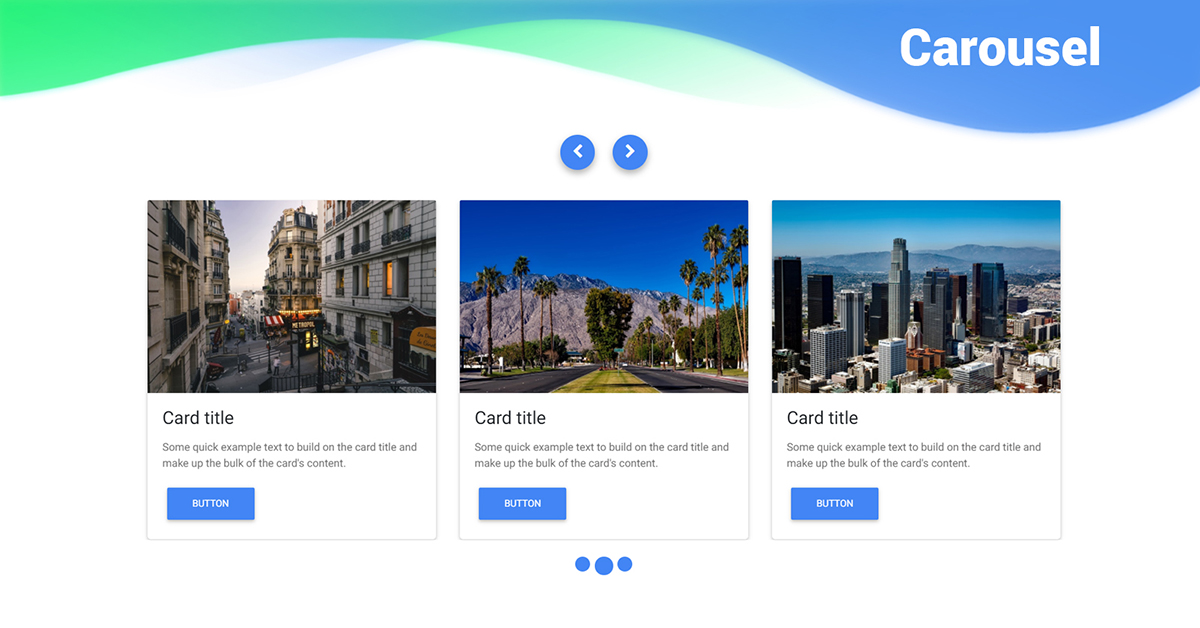
From a technical point of view, an image carousel is an UX component that displays content in a manner similar to a presentation. Also known as slider or slideshow, it has the main function of showing impact content to the user who arrives for the first time on the web page, and are usually used to display images, products and promotions on the home page (although they can also be found in other categories and pages of the site).

The sliders can have an automatic and timed playback system, or navigated manually by users, and this is also a decision that must be the result of conscious evaluations of web design.
Typically, these large banners consist of 3 to 7 different scrolling images, sometimes accompanied by a title and a CTA.
What is the image slider for
Before finding out how to technically optimize the slider, we need to understand how (and when) to use it on the site: it is important that this component is functional for the purposes of the project and has a single goal, otherwise it is likely to be confusing and unattractive to users.
In particular, e-commerce can take advantage of the slideshow to show ongoing promotions on products or to highlight special services, while an editorial journal will be able to highlight the latest or most read articles.
In addition, the carousel images can help to attract new customers – using it as a showcase on the added value of the brand and the site compared to competitors, also through the use of emotional images – or to strengthen brand awareness, For example, using graphics that bring out the numbers, statistics, certifications or prizes achieved.
Carousels and performance, tips for implementation
If properly implemented, an image carousel “should have little or no impact on performance”, explains Katie Hempenius on the web.dev blog introducing her guide to the impact of carousls on performance and best practices for the creation of high-performance carousels.
Often, however, these elements contain large multimedia resources, such as images (which can affect performance regardless of whether they are displayed in a carousel or elsewhere), and therefore require special care to avoid problems such as sudden movement of contents, slow loading times and control difficulties, which can result in a bad experience for the user.
The impact of carousels on Core Web Vitals
The author immediately analyzes the relationship between Google Core Web Vitals and sliders, highlighting the details for each of the three metrics.
- LCP, Largest Contentful Paint: large above the fold carousels often contain the LCP element of the page and therefore may have a significant impact on the LCP parameter; their optimization, therefore, can significantly improve the loading speed perceived by users.
- FID, First Input Delay: the carousels have minimal Javascript requirements and therefore should not affect the interactivity of the page. However, in the case of sliders with long running scripts you should “consider replacing carousel tools”.
- CLS, Cumulative Layout Shift: a “surprising number of carousels uses poor and unstructured animations that can contribute to CLS and in pages with auto-play carousels this can potentially cause infinite CLS”. This type of CLS is usually not evident to the human eye, and thus can become “an easy to overlook problem that can be avoided by not using uncompressed animations in the sequence (for example, during slide transitions)”.

Best practices to optimize carousels
If these are (some) of the risks of a lack of efficient implementation of the sliders, Hempenius then devotes himself to describe the best practices for the optimization of the performance of a carousel, which focus both on its technical architecture and on its content.
- Loading the carousel’s content using HTML
The content of the carousel must be loaded via the HTML markup of the page, so that it can be detected by the browser in the early stages of the page loading process. Using Javascript to start loading the carousel content is probably the first and biggest performance error to avoid when using these elements, because it will delay the loading of the image and negatively affect the LCP.
For advanced carousel optimization, the advice is to load the first slide statically, then gradually improve it to include navigation controls and additional content. This technique is more applicable to environments where you have a prolonged attention from a user, which allows time to load additional content. In environments such as home pages, where users usually only stay for one or two seconds, uploading a single image can be just as effective.
- Using a modern technology
Many sites use third-party Javascript libraries to implement carousels: the latest tools “tend to use more efficient Apis and are less likely to require additional dependencies such as jquery”.
However, reveals the author, you may not need to use Javascript at all, because “the new Scroll Snap API allows you to create native carousels with full functionality using only HTML and CSS, without requiring Javascript”.
- Optimizing the carousel’s content
Carousels often “contain some of the largest images on a site, so it may be worth taking some time to make sure these images are fully optimized“. For example, setting the correct image format and compression level, using an image CDN and the srcset attribute to provide multiple versions of images are all “techniques that can reduce image transfer size“.
How to measure the LCP of carousels
As mentioned above, carousels can negatively affect the parameter of Largest Contentful Paint, which is why it is important to be able to correctly measure these values. While not being “treated differently from any other UX element during the calculation of LCP, the mechanics of calculation for auto-play carousels is a common point of confusion“, clarifies Hempenius.
There are three key points to understand how the LCP calculation for image carousels works:
- LCP considers the page elements “as they are painted on the frame: new candidates for the LCP element are no longer considered once the user interacts (touches, scrolls or presses a key) with the page; therefore, any slide in an auto-play carousel has the potential to be the final LCP element, while in a static carousel only the first slide would be a potential LCP candidate”.
- If two images of equal size are rendered, “the first image will be considered the LCP element: this element is only updated when the LCP candidate is larger than the current LCP element; therefore, if all the carousel elements are the same size, the LCP element should be the first image displayed”.
- When assessing LCP candidates, LCP considers the “visible size or intrinsic size, depending on which is the smallest”: therefore, “If an auto-play carousel displays images of consistent size but contains images of intrinsic variable size that are less than the display size, the LCP element may change when new slides are displayed”. In this case, “if all images are displayed with the same size, the image with the largest intrinsic size will be considered the LCP element: to keep the LCP low, we must make sure that all the elements in an automatically reproducing carousel have the same intrinsic dimensions”.
How to improve sliders and use them on the site at their best
Now is the time to look at the best practices of user and product experience that we can follow during the implementation of the carousels, starting from a basic assumption: the carousels should “advancing our business goals and presenting content in a way that is easy to navigate and read”.
There are three areas to work on to have good results: navigation, readability and general management of functionality.
What are the best practices for navigation
- Providing navigation controls that are fully visible
The carousel navigation controls should be easy to click and highly visible, but according to Hampenius it is rare that this “is done well: most carousels have navigation controls that are both small and thin”. Another mistake is to underestimate the importance of the right contrast between image and text, thinking that a single color or style of navigation control can work effectively in all situations: a rare fact, because “for example, a clearly visible arrow on a dark background may be difficult to see on a light background”.
- Indicating the navigation progress
The carousel navigation controls should provide “a context on the total number of slides and the user’s progress through them”. This information makes it easier for the user to switch to a particular slide and figure out which content has already been viewed. In some situations, “providing a preview of the incoming content, whether it’s an extract from the next slide or a list of thumbnails, can be helpful and increase engagement”.
- Supporting mobile gestures
On mobile devices, carousels should support not only traditional navigation controls (such as on-screen buttons), but also scrolling gestures.
- Providing alternative navigation routes
It is unlikely that most users will interact with the entire content of the carousel, so “the content the carousel links to should be accessible from other navigation routes“.
What are the best practices for readability
- Do not use autoplay
The use of autoplay creates two “almost paradoxical” problems: on-screen animations tend to distract users and remove the eyes from the most important content; at the same time, because users often associate animations with ads, can ignore the carousels that are played automatically.
And so, “autoplay rarely is a good choice”: if the content is important, not using automatic playback will maximize the exposure; if the content of the carousel is not important, the use of automatic playback diminishes the most important contents. In addition, auto-play carousels can be difficult to read (and even annoying): people read at different speeds, so it is rare that a carousel constantly makes transitions at the right time” for different users.
Ideally, says Hempenius, “browsing between slides should be directed by the user via navigation controls”: if you really need to use automatic playback, Automatic playback must be disabled when the user mouse goes over it. Moreover, the transition speed of the slides should take into account the content of the slides: the more text contains a slide, the longer it should be displayed on the screen.
- Keeping text and images separated
The content of the carousel text is often “integrated” into the corresponding image file, rather than being displayed separately using the HTML markup. This approach is detrimental to accessibility, localization and compression rates, and “also encourages a unique approach to resource creation”. However, the same image and text formatting are rarely readable in the same way in desktop and mobile formats.
- Be concise
We have “only a fraction of a second to attract the attention of a user: a short and direct copy will increase the chances of our message being transmitted” and understood.
What are the best practices for the product
In general, carousels “work well in situations where the use of additional vertical space to display additional content is not an option”, and carousels on product pages are frequently a good example of this use case.
But these components are not always used effectively, and it should be borne in mind that, especially if they contain promotions or advance automatically, carousels can easily be mistaken by users for advertisements – and thus essentially ignored, for that phenomenon known as “banner blindness”.
In addition, sliders are “often used to placate multiple departments and avoid making decisions about business priorities”, and as a result “they can easily turn into a dump for ineffective content”.
Tips to best use carousels on the site
In conclusion, Hempenius offers two other basic tips to better implement the carousels on the site and exploit their full potential.
First of all, we should evaluate and test in advance “the business impact of carousels, especially those on the home page”: the percentages of clickthrough of the carousel can help us to determine if this element and its content are effective.
More generally, it is crucial to be relevant: “Carousels work best when they contain interesting and relevant content presented in a clear context”. If the content does not create engagement of a user outside of a carousel, inserting it in the slider will not improve its performance.
And so, when we implement a carousel, we need to prioritize the content and make sure that each slide is good enough to invite the person to click on the next one.