Bubble charts in Search Console to optimize SEO strategies

They are called bubble charts, and it is a tool widely used in science to describe the relationships between analyzed entities and facilitate the understanding of data. SEOs can also find benefits from these charts, and in the latest episode of Search Console Training Daniel Waisberg takes us through how we can optimize our site’s organic performance (also) thanks to these bubble charts.
What are bubble charts
At a general level, a bubble chart is a visual representation of data that precisely uses bubbles or circles of different sizes to display information, used especially when we want to visualize large datasets because it allows us to represent multiple pieces of information at once: each circle or bubble represents a variable and its size corresponds to the importance of the data, thus providing an immediate glance for analysis. Usually bubble charts use (and display) three dimensions of data: each entity, with its associated trio of data, is represented as a bubble, where the position of the bubbles on the chart may indicate two of the three dimensions, while the size of the bubble itself represents the third dimension.
For this reason, bubble charts prove very useful for highlighting the relationships between the quantities being investigated, because they quickly reveal the relevance of the entities, but also how the data influence each other and whether there are identifiable trends; in addition, the bubble chart can be customized to include different combinations of colors, legends, and backgrounds to make the presentation even easier to understand (as well as eye-catching).
Bubble charts are especially useful when you have large amounts of data and want to see relationships between different variables, but they can become confusing if there are too many bubbles or if the bubbles overlap; therefore, it is important to use them carefully and make sure they are always clear and easy for the audience to interpret.
Bubble charts and SEO, Google’s advice
Analyzing performance data in Search is always a challenge, but it is especially so if we have a lot of long-tail queries, which are harder to visualize and understand. As Google’s Search Advocate reveals, bubble charts can become our ally in the work of improving the performance of our website, because we can use them to analyze data on Search performance in Search Console.

In particular, they prove to be a great way to visualize multiple metrics and dimensions at once, simplifying the visualization of relationships and patterns in the data, and for example can be used to uncover relationships on traffic-related attributes (such as clicks, click-through rate, average position) for different queries and devices, identifying which queries perform well on the site, which could be improved or, brutally, which ones are not worth an investment of time and labor and we can therefore abandon.
In Waisberg‘s words, “a bubble chart is a great visualization when we want to compare multiple metrics and dimensions, because it allows us to see relationships and patterns in the data more effectively.”
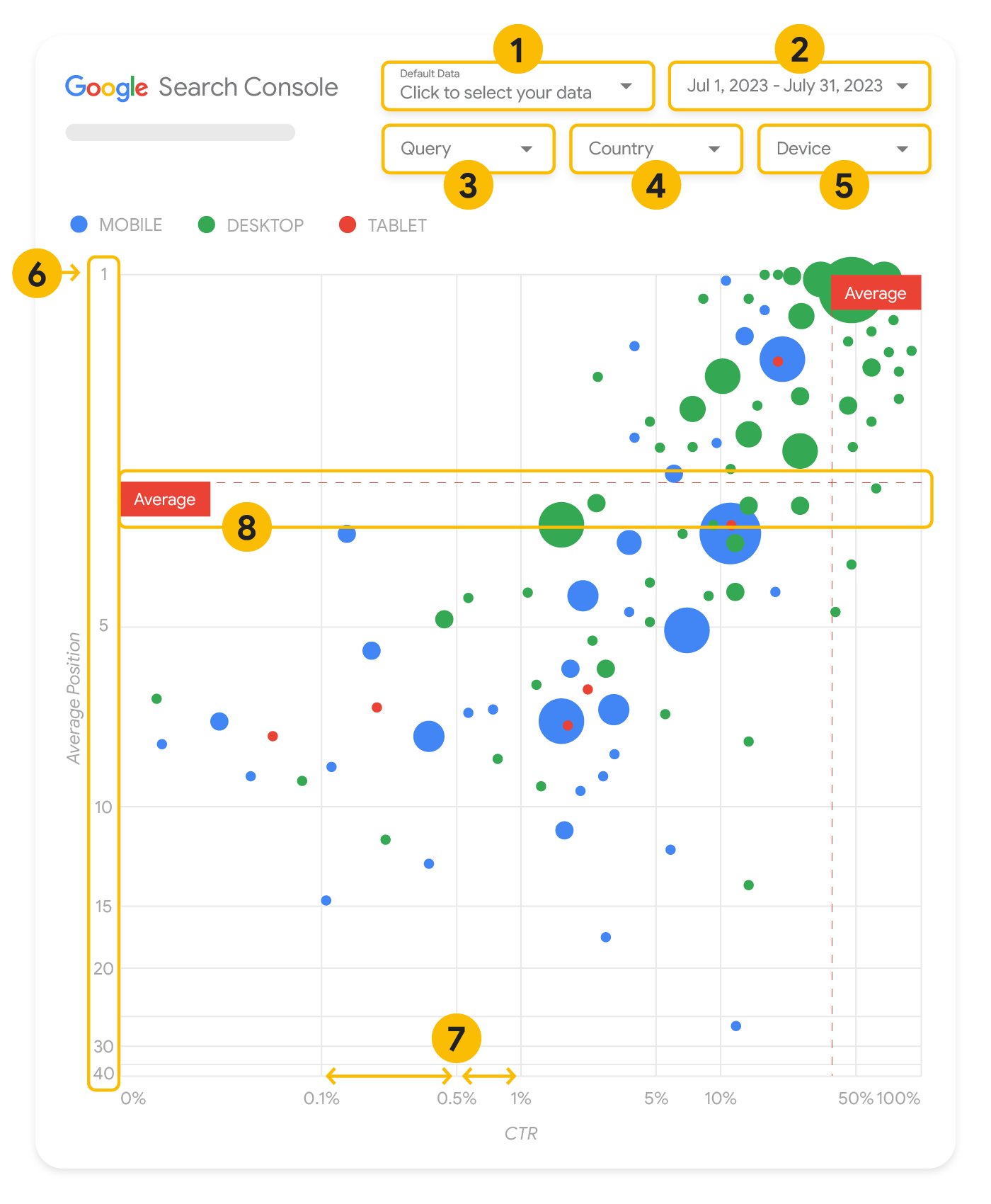
How to read bubble charts in Search Console
“Let’s start with the good news,” jokes the Search Advocate, who informs us that we can use a predefined bubble charts template without having to create the chart from scratch, simply by plugging in our site’s data and tweaking the settings as preferred.
The example mentioned in the video looks at the values of traffic volume (total clicks), Percentage of clicks and average position by query and device, thus putting us in front of the graphical representation of three metrics and two sizes, all at the same time. For this graph, the Site Impression table available through the Search Console data source was used, which includes performance data in Search aggregated by site and query.
Each bubble we see in the image is equivalent to a query, Waisberg explains, with two style properties:
- Size: the size of the bubble represents how many clicks that query brought to the website, and intuitively, the larger the bubble, the more traffic the query generated, so we can tell at a glance which queries generate the most traffic.
- Color: corresponds to the particular device used during the search (for each query we might see one bubble for a desktop search, one for a mobile search, and one for a tablet search) and helps us understand the differences between the performance in Search from different devices. We can use any size as a color, but as the number of values increases, it becomes more difficult to recognize patterns.
Continuing with the description, the Y-axis represents the average position of queries – in the case at hand, Waisberg says he used an inverted Y-axis, so the number one position is at the top, so as to meet the expectation that “the higher, the better” – while the X-axis represents the click-through rate, i.e., the Click count divided by the Impressions count, which can be an indicator of the relevance of the query to users in the SERP. From a technical standpoint, the Googler uses a logarithmic scale for both axes, believed to be a better way to understand data with a very wide range, such as (in this specific case) queries that are at the ends of the graph by CTR and average position.

Finally, the red lines represent the reference lines and show the mean for each of the axes, helping us to identify queries above or below a certain threshold by dividing the graph into quadrants. By looking at the mean, median, or a given percentile, we can call attention to deviations from the pattern.
Customizing the data and the graph
Google’s model provides five customization options that allow us to simplify data control:
- Data Control, to choose the Search Console property we want to analyze, simplifying the transition from one property to another.
- Date range, to choose the date range to display in the report; by default, the last 28 days are displayed, and the advice is to have at least a few weeks of data, because setting only a few days may not be statistically meaningful.
- Query, a filter to include or exclude queries to focus on (e.g., branded); we can use regular regex expressions similar to those used in Search Console.
- Country, a filter to include or exclude specific countries.
- Device, a filter to include or exclude device categories.
The new official guide to bubble charts
To better and more thoroughly clarify these concepts and how bubble charts work, in September 2023 Google published a specific guide to the topic, which allows pointing out some aspects only hinted at in the video.
In this second example, the bubble chart displays click-through rate (CTR), average position, and clicks for query and device dimensions in a single view, delving into some of the elements of the chart to clarify what it shows and what it does not.
First, the data source is the Site Impressions table available through the Search Console data source, which includes search performance data aggregated by site and query; again, the previous five customization options are present to control the data effectively.
The axes in the graph are average position (y-axis) and site CTR (x-axis), but with three significant transformations:
- Reverse direction of the y-axis. Since the y-axis shows the average position, inverting it means that 1 is up. For most graphs, the best position is in the upper right corner, so it is more intuitive to invert the y-axis when using it to display the average position.
- Logarithmic scale. Using a logarithmic scale for both axes provides a better understanding of the queries that lie at the ends of the graph (very low CTR, average position, or both).
- Reference lines. The reference line is very useful for highlighting values that are above or below a certain threshold. Looking at the mean, median, or a given percentile can draw attention to deviations from the pattern.
Each bubble in the graph represents a single query, with the following style properties:
- Size. Using the number of clicks as the bubble size helps you see at a glance which queries generate the most traffic: the larger the bubble, the more traffic the query generates.
- Color. Using the device category as the bubble color helps you understand the differences between mobile and desktop search performance. You can use any size as the color, but as the number of values increases, the more difficult it will be to recognize patterns.
The approach to data analysis
The goal of visualization with bubble charts is to help show opportunities for query optimization; as mentioned, the chart shows query performance, where the Y-axis represents the average position, the X-axis the CTR, while the size of the bubbles represents the total number of clicks and the color of the bubbles represents the device category.
In this way, we can try to divide queries into buckets to simplify prioritization and quantification of the effort we should invest in improving each one. In our support come the red reference lines, which, as mentioned, show the average of each of the axes and divide the graph into quadrants, showing four types of buckets and query performance (if our quadrants appear differently than what the video shares, it is normal, because it depends on the distribution of site queries).
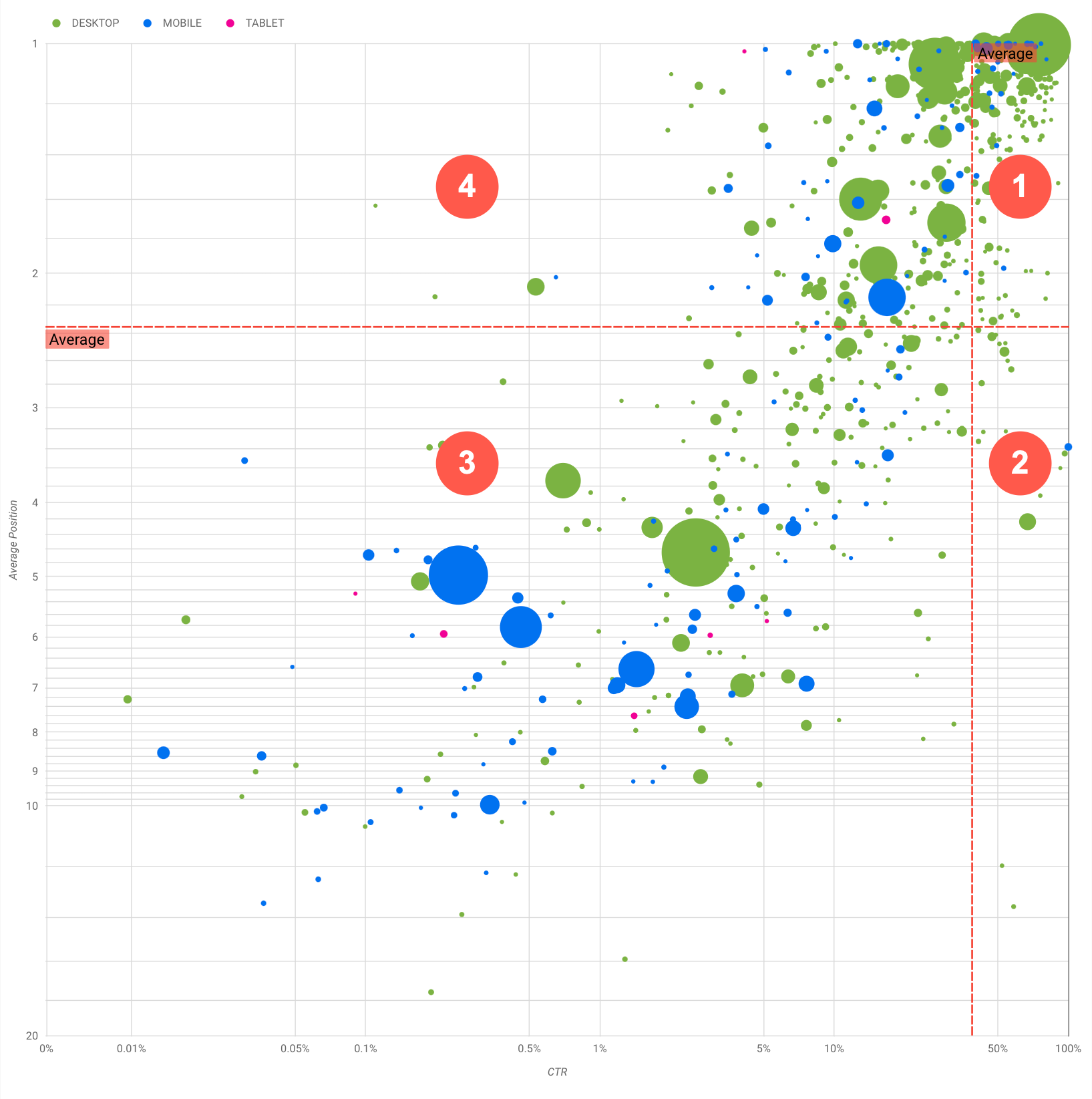
Overall, the graph shows four groups that we can analyze to decide what to focus on in query performance optimization work:
- Top ranking, high CTR: There is not much to do for these queries, we are already doing a great job, Waisberg summarizes.
- Low ranking, high CTR: Queries seem relevant to users, get high CTR even with a lower ranking than the average query on the website. They could make a significant contribution if their ranking improves, so it may be worth investing in their optimization.
- Low ranking, low CTR: When we analyze queries with low CTR (as in the next case), it is particularly interesting to look at the size of the bubbles to understand which queries have low CTR but still generate significant traffic. Although it might seem pointless to engage queries in this quadrant, they can be divided into two main groups:
– Related queries: if the query in question is important to our business, it should already appear in Search first. We prioritize these queries rather than those that are not shown in the Search results, since they will be easier to optimize.
– Unrelated queries: if the query is not related to our site, it might be a good opportunity to optimize the content so that we can focus on other queries that generate relevant traffic. - Higher ranking, low CTR: these queries might have a low CTR for various reasons, and it would serve to check the larger bubbles for the following signs:
– Competitors might have structured data markup and are shown with advanced results, which might lead users to click on their results instead of ours. We consider enabling Search results features for our site.
– We may have optimized (or we accidentally rank) for a query that does not interest users in relation to our site. This is not necessarily a problem for you if we can ignore those queries; however, if we prefer that people not find our site through those queries (e.g., if they contain offensive words), we should try to optimize content to remove mentions that might be seen as synonyms or related queries to the one bringing traffic.
– Users may have already found the information they needed, such as the opening hours, address, or phone number of our company (and therefore the low CTR is “normal”). To check this, we can check the queries used and the URLs that contained the information: if one of the goals of the website is to bring people to the physical stores, everything is working as expected; if you think people should visit the website for more information, it might be worth trying to optimize the titles and description to make it clear.
Added to these aspects is the difference between device categories, which can be used as additional indicators of query performance. For example, suppose that some queries are more relevant when people are browsing on the street, trying to find a location: in such a case, the query might perform high on mobile devices, but perform low on desktops.
Using bubble charts to optimize site performance
Using this quadrant division, we can identify useful queries worth investing time and resources in; in the video, Waisberg suggests optimizing our related pages by referring to Google’s SEO guidelines (the Search Essentials), paying particular attention to a few key aspects.

Specifically:
- Write (and control) title elements, meta description tags and alt attributes that are descriptive, specific and precise.
- Use heading elements to highlight important text and help create a hierarchical structure for content, helping both users and search engines navigate the document more easily.
- Add structured data markup to describe content to search engines and make it suitable for display in useful (and eye-catching) ways in search results.
- Identify terms and keywords that a user might search for to find one of our content. Waisberg recommends using the Keyword Planning Tool provided by Google Ads to discover new variants of keywords and know the approximate search volume for each of them, or referring to Google Trends to find ideas from queries or growing topics related to our website, but of course we can take advantage of SEOZoom’s keyword research tools, which allow us to get all the most valuable information about the words that will be the fulcrum on which to build winning content that is in line with readers’ needs.