
10 tips to create mobile friendly content

It is a fact and now well established: most people in the world connect to the Net through mobile devices, and according to StatCounter statistics over 55 percent of global web traffic currently comes from smartphones and tablets, while desktop has dropped to 45 percent of accesses. The numbers are similar in Italy as well, and this confirms to us that, now more than ever, it is time to continue working to improve the mobile friendly features of our site, putting together technical insights for the optimization of the mobile user experience and, no less important, more targeted interventions in content creation for the so-called mobile SEO, so as to ensure a smooth and engaging experience for our readers.
SEO Mobile: optimization must also consider content
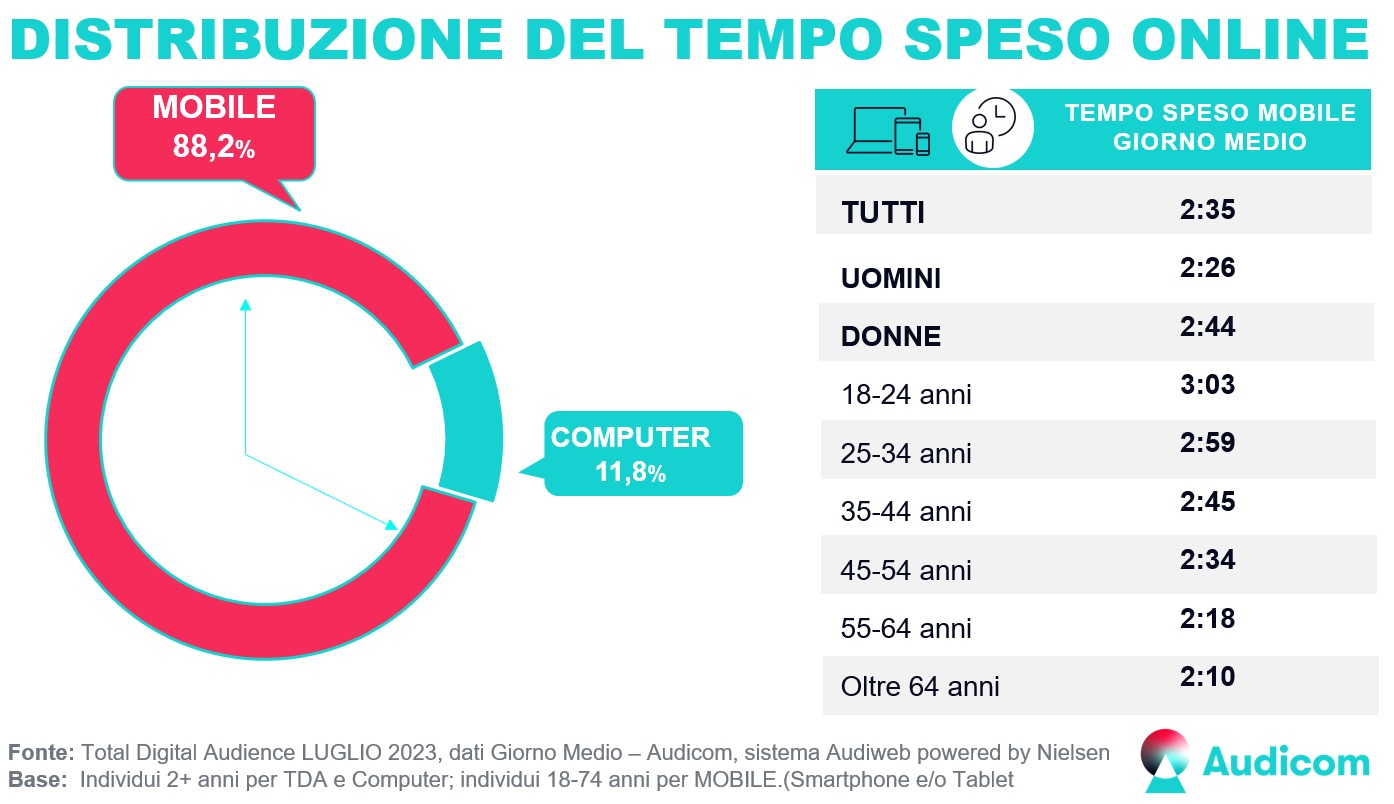
Looking a little closer at the data on the diffusion of mobile connections in Italy, we can find further confirmation to what we were saying earlier, namely that page optimization for those who browse from smart devices is today unavoidable.
Specifically, Audiweb certifies that in Italy the online audience reached 43.4 million users, who browsed for 67 hours, equal to 2 days and 19 hours overall; analyzing the population between 18 and 74 years old, almost 40 million people browsed from mobile, equal to 92 percent of the total, who generated the bulk of the time online with more than 65 hours overall.

The report makes a focus precisely on the distribution of time spent online, which reflects what is called “the continued dominance of fruition from Mobile (Smartphone and/or Tablet),” capable of totaling 88.2 percent of the total time devoted to Internet fruition in our country.
The last piece of data that is useful to know concerns browsing preferences, which measure the time spent on different categories of sites and applications: in fact, it is Search, which garners more than 41 million unique users, accounting for more than 79 percent of all people online in Italy, that catalyzes attention.

In short, the numbers clearly tell us that mobile is the first channel we need to think about in order to hope to intercept users and that, a far from negligible aspect (although this is no surprise), Google is essentially the most viewed site by web surfers, who then start from those SERPs to complete their journey.
Yet, there is one aspect that we still risk neglecting: namely, we think about optimization for mobile devices in terms of working to ensure that web pages are usable from a technical standpoint, and thus, for example, responsive for viewing on a display of any size. But offering mobile-friendly sites and pages also means putting effort into creating content optimized for mobile users, focusing on the overall experience people will have when they visit the website.
To put it another way, then, content plays a key role in mobile SEO.
The value of content for the SEO and mobile SEO
We have often focused on the centrality of content for SEO and these considerations also apply (if not more) to the mobile site, where each component – text, images, videos, slideshows and other multimedia elements – They need to be tailored to the people who actually use them and the way they do it.
So, if a responsive design is critical to attracting and keeping customers relying on mobile devices, only by offering equally effective content can we turn these users into customers, have conversions, retain readers.
The starting point that we must not overlook is that the way people read on a mobile device is different from the way they read from a desktop screen, for “physical” issues (the different screen sizes first), but also for “approach”. Mobile reading is more fragmented, often episodic, generally faster and so on.
In addition, as the experts explain, there is also a “psychological” difference: when we visualize information from a desktop screen we are used to look at some areas in particular – such as pinball pattern that analyzes user behavior towards Google – but when we use a smartphone the situation is completely different. More specifically, the attention of the eyes on mobile display is more distributed and there is no “more important” area, to be optimized first, because all the content needs care and commitment.
Last related consideration: Google has long adopted a mobile-first approach to website indexing, and in most cases evaluates the mobile version of the site first in order to include it in the Index and then determine its placement in search results. Therefore, if our content is not optimized for viewing on mobile devices we start at somewhat of a “disadvantage,” potentially losing valuable positions in search results and site visibility, with inevitable negative effects on conversion opportunities.
10 tips to optimize mobile content
In light of these considerations, and building on Chelsea Alves’ article, we have put together 10 tips for mobile content optimization, that can be used to develop content that involves and converts customers who reach the site browsing from smartphones and the like.
These are rather simple indications, but they can serve to increase the potential of conversion and improve the path of the customer, helping to reach the right level of quality to communicate our message, educate customers and convince them to buy our product and service rather than interact with the pages of competitors.
The bite, snack and meal approach
On a general level, we can follow the classic “bite, snack and meal” approach, the content writing and editing strategy presented for the first time by Leslie O’Flahavan in 1997 during her web writing courses, which focuses on the differentiation of the traffic of readers and on the methods to capture them at their best.
According to this theory, we can divide the contents for the web into “bite, snack and meal” and write to satisfy the different appetite of a variety of visitors:
- The Bite, is a title with a message: its task is to stimulate the interest of the most impatient readers and convince them to start or continue reading. It is the highest level, which must capture the user’s attention and provide a clear idea of what the content is about.
- The snack, is a concise summary that provides enough information for an overview of the contents of the page. The reader should have an idea of the content topic just by reading this summary. It is the intermediate level, where reader can find additional details, examples, or statistics that add value to the content without being too long or complex, so as to form a fairly comprehensive idea of the topic.
- The meal, is the complete and original content. This is the most detailed level, where we delve into the topic with all the necessary information. This section should be well structured and easy to navigate, so that users can easily find the information they are looking for.
It is, if we look closer, a style of writing that resembles in some ways the famous theory of the “inverted pyramid”, which advises the reader to first present the most important details and then the secondary ones, and that can help us present content in a way that is easily usable on mobile devices. By taking this approach, we can create content that is easily usable on mobile devices while maintaining a high level of detail and quality; moreover, this method allows us to present information in a format that is both engaging for the user and favorable for SEO.
- Create strong introductions
According to recent studies, visitors spend on average 3 minutes or less on a website: seizing their attention is therefore a matter of timing.
As we said before, then, there is also the physical aspect to keep in mind, because smartphones are much smaller than the desktop counterpart.
There is therefore less room to transmit the message, less areas to be exploited, and we must consider optimally the initial information that will be presented to a mobile visitor.
In most cases, in fact, the reader from your smartphone will see only a few paragraphs at most before you have to scroll down for more information: this means that the introduction of any web page must succeed in transmitting your most convincing information to hook the reader and convince him to continue and go further.
The suggestion, in the wake of the bite, snack and meal strategy, is to create effective presentations that get to the point quickly and are not stuffed with unnecessary information: we need to add immediate value to visitors, presenting them immediately the most relevant information related to the topic.
- Using a brief title
By definition, the bite is quick, and so must be the title, which is the first introduction to the content that comes and which also determines the way the webpage will be presented in the search (although, just recently, Google has again put its hand to the system of generating title tags in SERP).
From a practical point of view, the maximum length of the title tag for mobile devices is about 78 characters and mobile titles can also be displayed on two lines: despite this, experts agree that page titles should be short and concise, only viewable on a row in mobile search results.
And so, we must try to limit the length of the titles, using no more than six words or about 70 characters: the shorter the title, the less your readers will have to strive to understand the topic of the content.
It is also worth another classic SEO advice, that is to insert the main keyword at the beginning of the title to try to improve the positioning and detection of the search.
- Offering a summary or a list of highlights
Offering a snack to the reader is a good way to stimulate his appetite: insert a summary before the bulk of the article, in which the key points of the content are highlighted, is therefore usually an effective method to give mobile users relevant information appropriate to their (generally) limited attention.
Through this summary we also comply with the golden rule of providing information at the top of the web page, and at the same time we emphasize content that could lead to links and shares on social media.
- Subdiving the content in brief paragraphs
Also because of the small screen size, reading huge blocks of text can be a nightmare from a mobile device, and to facilitate reading we have to work on the structure of content. Actually, as we know, the use of a paragraph subdivision and an effective heading management is also important for the desktop, but with mobile becomes a prerogative.
This practice is called chunking and involves presenting related content together in small blocks, or rather units of meaningful and visually distinct content that make sense in the context of the larger set.
Another approach is the one identified by Jon Ziomek, who suggests to focus on the 1-2-3-4-5 scheme to eliminate the need to scroll to consume more content: paragraphs must contain an idea, expressed in two or three sentences that occupy no more than four or five lines on the page. According to the expert, when it reaches the six lines the paragraph becomes longer than an inch, an excessively long measurement for most readers, especially from mobile devices.
- Consider the way to consume content
We said it: the way users use content on a desktop is different from the way they browse from a mobile device. Eye tracking research shows that web page visitors scan phone sites and screens in various patterns, all factors that should be considered when developing content.
Among the best known patterns are:
- Bypassing. A user skipping the first words of the line when multiple lines of text start with the same word or words.
- Commitment. Rare case of user reading every word on the web page.
- Layer-cake. Person reading headers and subtitles and skipping the normal text in between.
- Marking. User who focuses on a point while scrolling the page, which results in a pattern more common on mobile devices than desktop ones.
- Spotted. Reader who skips large blocks of text and looks for something specific, such as a link, an invitation to action (CTA), an image or other.
- Removing unnecessary words
A simple and direct writing should be the basis of any content, whether for desktop or mobile devices.
One of the means of verifying compliance with this good standard is the Flesch Reading Ease formula, which serves to determine the readability of a text by taking into account various parameters, including the average length of sentences (measured by the number of words) and the average number of syllables per word.
Obviously, this is just an automated test that says little about the actual readability of the content, but we can apply these cues in the creation of mobile friendly content, respecting some elements when it comes to writing:
- Shorten sentences, avoiding the use of phrases that are too long, confusing and difficult to process.
- Avoid using difficult words, especially those with four or more syllables, which are considered difficult to understand.
- Do not use modifiers and determiners; the formula refers purely to the English language, while in Italian we can advise not to use parts of the speech such as “adjectives, adverbs, demonstrative, possessive determinants, prepositional phrases, degree modifiers and intensifiers” if not when strictly necessary.
- Avoid the redundancy.
- Do not provide excessive details, which may overly complicate the message we are trying to convey.
- Adding images/videos
Studies suggest inserting multimedia elements into all content, when and where possible. First of all, images or videos interrupt the text, making the contents easier to digest, but above all they add a visual component that can be decisive, considering that we live in the era of attention economy.
Research indicates that images are processed up to 600 times faster than text, so using graphic media can also help readers better understand the topics. Another way to strengthen concepts is the use of video, which are often well appreciated by consumers.
In addition, element not to be overlooked, videos and images also allow us to compete and have greater opportunities for visibility in advanced search results, such as the Video tab or Google Image Search.
- Taking care of text readability
Often details make the difference, especially in terms of errors with the user experience: not using high contrast colors or setting a font that is too small, for example, can make content difficult to read and view.
Best practices for readability on a mobile device recommend using fonts larger than 32 points, using high contrast colors for aesthetics and accessibility of information: the classic white text on black background (or vice versa) are adequate in this sense, while other low-contrast combinations, such as yellow text on a white background, are difficult to read.
Insufficient contrast can create problems especially for colorblind people, who cannot distinguish between certain colors, such as red and green; in addition, low contrast sensitivity becomes more common with age.
- Strategically place CTAs
The differences between desktop and mobile also require changing the approach to call to actions for the two targets: in particular, mobile readers expect to quickly find the information they need, and so we (still) less opportunity to capture their attention.
The most effective strategy is to provide them with action to take within a few seconds of browsing the site, or we risk losing conversion opportunities; for this, the CTA should be placed in the foreground and in the center at the top of the site, to better assist readers through the sales funnel.
The more visually distinct and explicit the CTA is on the site and on the page, the more opportunities there are to reach the final goal, especially for those who visit us from mobile devices.
- Controllare prima della pubblicazione
The last suggestion is very practical: before clicking on “publish” it is always better to preview the page and verify that there are no errors or problems.
Usually, however, this check is only to verify how the desktop content looks, but we must also include in the editorial process the preview of the display on mobile devices, trying in particular to pay attention, among other things, to these aspects:
- Better subdivide the paragraphs.
- Add relevant subtitles.
- Identify areas where you might need to insert supporting images.
- Consider streamlining text blocks or adding white space.
A second check on mobile devices should make us safe from posting content with errors, a situation that can lead visitors to consider the brand as less credible and less authoritative.
